
Choosing and combining colors in graphic design can sometimes be more challenging than originally expected. It’s like trying to mix ingredients without a recipe, hoping for the best, and sometimes ending up with a culinary disaster. But what if I told you there are some fundamental rules and clever tricks that can transform your design from “meh” to “magnificent”?
Think about it – color has the power to evoke emotion, convey meaning, and grab attention. It’s the secret sauce that makes a brand memorable, a website engaging, or a poster truly captivating. So, how can you, yes YOU, learn to wield this powerful tool effectively? This isn’t about becoming a color guru overnight, but about gaining the confidence to select colors that work and create visual harmony. Are you ready to finally understand the magic behind color combinations? Let’s explore the world of color theory and learn how to master the art of mixing!
The Color Wheel: Your Design Compass
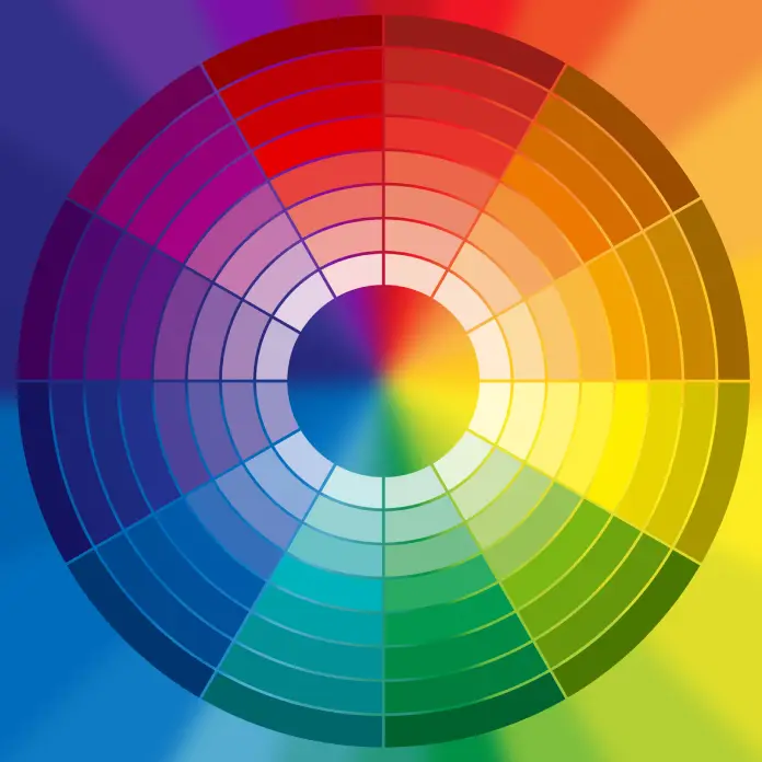
Okay, so first things first, let’s talk about the color wheel. It’s not just a pretty circular rainbow. Think of it as your roadmap to harmonious color combinations. It’s basically a visual guide that shows the relationship between different colors. The core of the color wheel are the primary colors: red, yellow, and blue. These are the building blocks – you cannot create them by mixing other colors.
Then, we have the secondary colors: orange, green, and purple. These are made by combining two primary colors. For example, mixing red and yellow makes orange. Finally, there are the tertiary colors, which are created by mixing a primary and a secondary color, such as red-orange or blue-green. See? It’s not so intimidating when you break it down!
Now, let’s talk about some important concepts related to the color wheel that will help you make smart decisions for your graphic designs:
- Hue: This is just another word for the pure color itself (red, blue, green, etc.)
- Saturation: This refers to the intensity or purity of a color. Is it vibrant and strong, or washed out and muted?
- Value (or Brightness): How light or dark a color is. Think of it like adding white or black to a color.
Understanding these simple elements will allow you to make more intentional choices and avoid colors that clash!

Finding Harmony: Understanding Color Relationships
So, you have the color wheel, but how do you use it to create great combinations? There are some rules, or rather, guidelines, that are very helpful. Here’s where you get to become a color combination master:
- Complementary Colors: These are colors that sit directly opposite each other on the color wheel, like red and green or blue and orange. They create a high contrast and are good for grabbing attention. Be careful though: too much of these combinations can be overwhelming.
- Analogous Colors: These are colors that sit next to each other on the wheel, such as blue, blue-green, and green. Analogous color schemes are harmonious and create a sense of calm and unity.
- Triadic Colors: These are three colors that are evenly spaced on the color wheel. A triadic scheme offers a good balance, and can be eye-catching without being too jarring. Think red, yellow, and blue, or green, orange and purple.
Colors and Their Meanings: Setting the Right Tone
Colors aren’t just pretty faces. They have their own language and can evoke specific emotions. Before you select the color palette, think about what type of message you want to communicate. Here’s a quick rundown of common color associations:
- Red: Passion, energy, excitement, urgency. It’s a powerful color, perfect for calls to action or topics that demand attention.
- Blue: Trust, calmness, professionalism, security. Blue works wonders for businesses, particularly finance, tech, and healthcare.
- Green: Growth, nature, freshness, health. It’s great for eco-friendly brands and anything related to the outdoors.
- Yellow: Happiness, optimism, creativity, joy. It’s perfect for cheerful content and brands that want to project positivity.
- Orange: Enthusiasm, playfulness, creativity, warmth. Great for branding that seeks a balance between energy and friendliness.
- Purple: Royalty, luxury, creativity, wisdom. Often used for high-end products, spiritual topics, or imaginative projects.
- Black: Sophistication, power, elegance, authority. Used for luxury brands and minimalist designs.
- White: Purity, cleanliness, simplicity, peace. Often used for a clean and modern look.
Keep in mind that color associations can vary across cultures, so doing some research is important if you’re designing for a global audience!
The Magic Formulas: 60-30-10 and 60-40 Rules
Now, let’s get to the practical part – combining colors in a way that works wonders! A great starting point is the 60-30-10 rule when you are working with three colors. Think of it as a recipe for a balanced color scheme:
- 60%: This is your dominant color. This should be the main color for backgrounds and large elements. It should be a neutral or calmer color.
- 30%: This is your secondary color. It supports the dominant color and adds interest. Use it for mid-sized elements or text.
- 10%: This is your accent color. It’s used for small areas, like highlights, buttons, or call-to-action. It’s used to draw the eye and add a pop of visual interest.

But what if you only have two colors? In this case, the 60-40 rule is your best choice:
- 60%: This is still your dominant color. Use it for backgrounds, large shapes, and a general base for your design.
- 40%: This is your secondary color. Use it for accents, text, shapes, and any other element you want to pop out.

Remember these are just guidelines and not set in stone. You can adjust these ratios slightly to get your desired effect. The most important point is to have one color be dominant in your composition.
Combining Colors: Let’s Get Practical
Alright, let’s think about how all of this applies to different designs and topics. Imagine you are designing a website for a sustainable coffee brand. What colors would you choose? Probably a dominant soft green, with earthy browns as secondary, and maybe a pop of vibrant yellow to catch the eye on call-to-action buttons. This combination will communicate natural, organic, and invigorating vibes.
Now, imagine you are designing a campaign for a new technological company. Here you might choose a dominant cool blue, a techy gray as a secondary, and a bright purple as an accent color. This combination is perceived as modern, professional, and innovative. See how color can influence the way an audience receives the information.
Here are a few tips for mixing colors successfully:
- Start Simple: Don’t feel the need to use a million different colors. Start with two or three and see what you can create.
- Use a Color Palette Generator: If you’re feeling stuck, there are many free online tools that can help you generate beautiful color combinations.
- Look at Existing Designs: Study designs that you admire and analyze the color combinations that they use.
- Trust Your Gut: At the end of the day, use your own best judgment and do not be afraid to experiment.
Your Color Journey Starts Now
Choosing and combining colors might seem complicated at first, but it’s actually a skill you can improve with practice and a basic understanding of color theory. Remember that the most important part is to be intentional with your choices. Think about what you want to convey, what emotions you want to evoke, and what mood you are trying to set. Don’t be afraid to experiment and develop your own signature style.
By applying the 60-30-10 rule or the 60-40 rule and the knowledge of how colors interact, you can create harmonious and compelling designs that stand out from the crowd. And remember, the color wheel is not your enemy; it is your guide.
Now go ahead and create something amazing! You’ve got this!
Header image by Svitlana (available for free download via Adobe Stock). Check out our Graphic Design section to learn more.
Subscribe to our newsletter!


