
Hey design fam, let’s talk about making your brand designs pop. We all know the importance of a strong visual identity, but sometimes, even the most skilled designers can fall into the trap of “been there, seen that” aesthetics.
Today, we’re unveiling a simple yet powerful design trick that can elevate your branding and leave a lasting impression. It’s all about embracing the power of negative space.
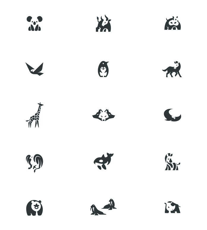
Negative space, also known as white space, is the area around and between your design elements. It’s often seen as “empty” space, but in reality, it’s a crucial design tool that can:
- Enhance readability: By providing breathing room between elements, your design becomes easier to understand and navigate, especially for complex layouts.
- Emphasize key elements: Leaving negative space around a specific element naturally draws the viewer’s attention, making it stand out.
- Create a sense of balance and harmony: A balanced use of negative space creates a sense of order and sophistication, even in busy designs.
- Evoke emotions: Strategic use of negative space can convey different emotions, from tranquility (think minimalist designs) to energy (think dynamic compositions).
Here’s how to leverage negative space effectively:
- Start with intention: Don’t just leave empty space – purposefully utilize it. Think about how it can enhance your message and guide the viewer’s eye.
- Balance is key: Avoid both excessive clutter and too much emptiness. Find a balance that works for your specific design and brand personality.
- Consider hierarchy: Use negative space to create a visual hierarchy, directing the viewer’s attention to the most important elements.
- Play with unconventional layouts: Don’t be afraid to experiment with asymmetrical layouts or negative space shapes that complement your design.
Remember: Negative space is not just the absence of design; it’s an active design element with immense power. By mastering its use, you can create truly memorable and impactful branding that sets your clients apart.
Pro tip: Take inspiration from renowned brands like Apple, whose minimalist approach utilizes negative space masterfully, creating clean and iconic designs.
So next time you’re crafting a brand identity, remember the hidden potential of negative space. With a little intention and creativity, you can transform it into a powerful tool that elevates your designs and makes them stand out from the crowd.

Feel free to find other inspiring content in the Graphic Design and Branding categories on WE AND THE COLOR. In addition, you should take a look at these 10 graphic design trends you shouldn’t miss in 2024.


