
This post contains affiliate links. We may earn a commission if you click on them and make a purchase. It’s at no extra cost to you and helps us run this site. Thanks for your support!
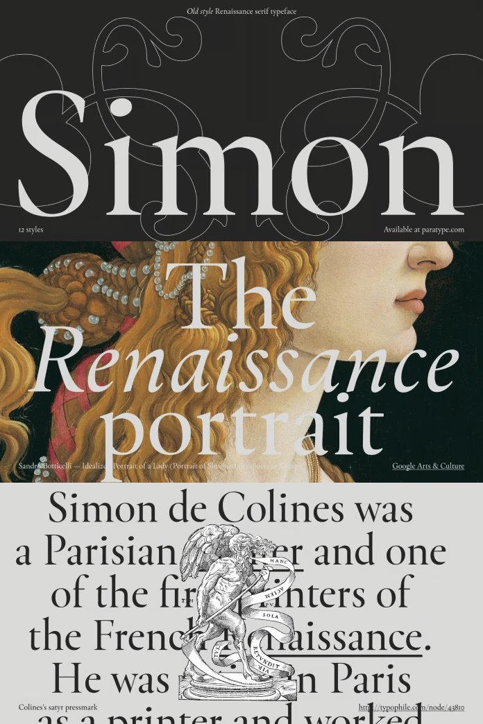
I’m so happy when I can talk about typefaces. Some shout, some murmur, some are just… there. But every so often, you stumble upon one that feels special. It has a story, a character, and a certain quiet confidence. It doesn’t just display text; it enhances it, gives it a soul. Have you ever thought about where these digital letterforms come from? Many have fascinating histories, sometimes stretching back centuries. They are echoes of past masters, reimagined for today’s screens and pages. This brings us to a particularly elegant example: the Simon font family from ParaType. This beautifully designed serif typeface carries the weight of history, the touch of Renaissance craftsmanship, all wrapped up in a modern digital package.
Think of it as a bridge connecting the 16th century with your latest design project. Intrigued? You should be. The Simon font family offers a unique blend of calm sophistication and remarkable versatility. Let’s get acquainted with this typographic gem.
A Nod to History: The Roots of Simon
Before we explore the digital intricacies, let’s journey back. Way back. To 16th-century France, a time of great change and artistry in printing. Enter Simon de Colines. He wasn’t just a printer; he was a scholar, a publisher, and a highly skilled punchcutter – the original font designer, if you will. Colines was known for his elegant Roman and Italic types, contributing significantly to the evolution of typography during the French Renaissance. His work possessed a certain grace, a clarity that made texts beautiful and readable.
Why does this matter today? Because the Simon font family is a direct revival of his influential work. ParaType didn’t just copy; they studied, interpreted, and revived the spirit of Colines’s letterforms. This revival breathes new life into his legacy, making that historical elegance accessible to contemporary designers. So, when you use the Simon font family, you’re not just choosing a font; you’re engaging with a piece of typographic history. It’s a quiet conversation with a master craftsman from centuries ago.
Meet the Modern Revival: The Simon Font Family Aesthetic
So, what does the Simon font family actually look like? Imagine a serif typeface that feels calm and gentle. It has soft features, nothing too sharp or jarring. It speaks with a quiet authority, perfect for conveying information clearly without overwhelming the reader. ParaType describes it as a “ruhige und weiche Serifenschrift” – a calm and soft serif font. This description captures its essence beautifully.

This inherent calmness makes it exceptionally well-suited for projects that require a touch of class and readability. Think about high-quality book printing. Can you picture its gentle serifs guiding the eye across a page of classic literature or thoughtful non-fiction? It feels right at home there. But its utility doesn’t stop at books. Consider projects related to history, culture, or even high fashion. The Simon font family lends an air of established quality and timeless style. It suggests heritage and refinement.
Tailored Precision: Understanding Optical Sizes in the Simon Font Family
Here’s where the Simon font family truly shows its modern sophistication: optical sizes. What exactly does that mean? Have you ever noticed how a font that looks great as a headline can become clunky or hard to read when shrunk down for body text? Or how a font designed for small text might lack impact when blown up large? Optical sizing addresses this directly.
Font designers create different versions of a typeface optimized for specific size ranges. Features like stroke contrast, spacing, and even the height of lowercase letters (x-height) are subtly adjusted. This ensures the font remains legible and aesthetically pleasing, no matter the size.
The Simon font family excels here, offering four distinct optical sizes:
- Caption: Designed for the smallest text sizes, like footnotes or photo captions. Clarity and legibility are paramount here, often featuring slightly wider characters and sturdier strokes.
- Text: Optimized for body copy in books, articles, and long-form reading. It strikes a balance between readability and elegance for comfortable reading at typical text sizes (around 9-14 points).
- Subhead: Bridging the gap between text and display. Perfect for subheadings, pull quotes, or introductory paragraphs where you need a bit more presence than body text but less flourish than a main headline.
- Display: Crafted for maximum impact at large sizes. Think headlines, titles, and cover designs. These styles often exhibit finer details, higher contrast, and tighter spacing, giving them more expressiveness and flair.
This thoughtful approach means you can maintain a consistent typographic voice across your entire project, from the tiniest note to the boldest statement, all while ensuring optimal performance for each specific use case within the Simon font family.
The Power of Variation: The Variable Font Option
And if four optical sizes weren’t enough control? The Simon font family also comes bundled as a variable font. What’s a variable font? Think of it as having all the optical sizes (and potentially weight or other variations) packed into one single, flexible file. Instead of being limited to the four predefined steps (Caption, Text, Subhead, Display), a variable font allows you to select any point along that spectrum using a slider.
Need something precisely between Text and Subhead? No problem. Want to fine-tune the appearance for a very specific point size on a particular screen resolution? The variable Simon font family gives you that granular control. It’s the ultimate tool for typographic perfectionists, allowing you to dial in the exact optical size characteristics your design requires. This technology represents the cutting edge of font usage, offering unprecedented flexibility.
A Typographer’s Toolkit: Styles and OpenType Features
Beyond its historical roots and optical sizing, the Simon font family is packed with features. It boasts a robust family structure with 15 distinct styles. This includes upright (Roman) and matching Italic variants across the four optical sizes, plus the variable font. That’s a lot of versatility packed into one family.
Each of these styles contains over 900 glyphs. What are glyphs? They are the individual characters, symbols, punctuation marks, and ligatures within a font. Having 900+ means extensive character support. The Simon font family supports Extended Latin (covering most Western and Central European languages) and Extended Cyrillic alphabets. This makes it suitable for projects targeting a wide range of languages – over 200 in total!
But wait, there’s more! The Simon font family leverages powerful OpenType features (over 25 of them!). These are like secret codes embedded in the font file that unlock advanced typographic capabilities. What can you expect?
Here are some typographic facts:
- Small Capitals: Proper, beautifully designed small caps in the upright styles, perfect for emphasis or setting acronyms without disrupting text colour.
- Figure Styles: Six different styles of numerals!
- Lining Figures: Standard numbers that align with the height of capital letters.
- Oldstyle Figures (Medieval): Numbers with ascenders and descenders (like 3, 4, 7, 9 dropping below the baseline), blending seamlessly with lowercase text.
- Tabular Figures: Each number takes up the same amount of space, perfect for aligning numbers in tables or columns.
- Proportional Figures: Numbers with varying widths based on their shape (e.g., ‘1’ is narrower than ‘0’), generally preferred for setting numbers within text.
- Superior & Inferior Figures: Smaller numbers for footnotes, exponents, and fractions.
- Ligatures: Special characters that combine two or more letters into a single, more aesthetically pleasing glyph (like ‘fi’ or ‘fl’). Simon includes non-standard ligatures too, for extra stylistic options.
- Localized Alternates: Specific character variations tailored for languages like Bulgarian, Serbian, Bashkir, Chuvash, and Polish, ensuring correct and culturally appropriate typography.
- Case Sensitivity: A clever feature where punctuation like hyphens and quotation marks automatically adjust their vertical position when you type in all caps, maintaining proper alignment.
These features transform the Simon font family from a simple set of letters into a sophisticated typographic system, giving designers fine-grained control over their text’s appearance.
Where Can You Use the Simon Font Family?
With its rich features and versatile nature, where does the Simon font family shine brightest? Its core strength lies in projects demanding readability and quiet elegance.
- Books, Magazines, and Poetry: The Text optical size is ideal for setting long passages of text. Its calm demeanor makes for comfortable reading. The Display styles create beautiful, impactful covers and titles.
- Historical and Cultural Projects: Its connection to Simon de Colines gives it authenticity for museum publications, historical articles, or branding for cultural institutions.
- Fashion Branding: High fashion often relies on classic, refined typography. Simon’s elegance fits perfectly for logotypes, packaging, and editorial content where sophistication is key.
- Restaurant Menus: Imagine a fine dining menu set in Simon. It subtly communicates quality and attention to detail.
- Cosmetic Packaging: Similar to fashion, cosmetics often use type to convey luxury and purity. Simon can provide that upscale feel.
The key takeaway? Choose the right optical size for the job. Use Display or Subhead when you need expression and impact at larger sizes. Rely on Text or Caption for clarity and readability in smaller point sizes. And remember the variable version if you need that ultimate fine-tuning capability. The versatility of the Simon font family is truly impressive.
The Minds Behind the Font
A typeface revival like this doesn’t happen by accident. It requires skill, research, and a deep understanding of both historical context and modern technology. The Simon font family was initially conceived and designed by Krista Radoeva. Her vision was then expertly completed and refined by Dmitry Goloub and Alexander Lubovenko. This collaborative effort brought the spirit of Simon de Colines into the 21st century.
The foundry behind this exquisite family is ParaType, a well-respected name in the type world known for its high-quality fonts and significant contributions, particularly in Cyrillic typography. Their expertise is evident in the polish and technical proficiency of the Simon font family.
Why Choose Simon?
So, after exploring its history, features, and potential uses, why should the Simon font family be on your radar?
It offers a unique blend of historical resonance and modern functionality. It’s not just another serif; it’s a revival carrying the elegance of the French Renaissance. Its sophisticated system of optical sizes and the inclusion of a variable font provide unparalleled control over readability and expression across different applications. The extensive character set, covering Extended Latin and Cyrillic, along with numerous OpenType features like true small caps and multiple figure styles, makes it a powerful tool for demanding typographic tasks.
Have you been looking for a typeface that feels both timeless and perfectly suited for contemporary design? Could the Simon font family be the missing piece for your next book design, branding project, or editorial layout? It offers quiet confidence, historical depth, and technical excellence. Perhaps it’s time to let the legacy of Simon de Colines grace your own creations through this exceptional revival by ParaType. The Simon font family is waiting to tell its story through your work.
You can find more reviews of stunning typefaces in the Fonts category on WE AND THE COLOR.
Subscribe to our newsletter!


