This post contains affiliate links. We may earn a commission if you click on them and make a purchase. It’s at no extra cost to you and helps us run this site. Thanks for your support!
Font Review: Rig Shaded is a Masterpiece of 3D Typography
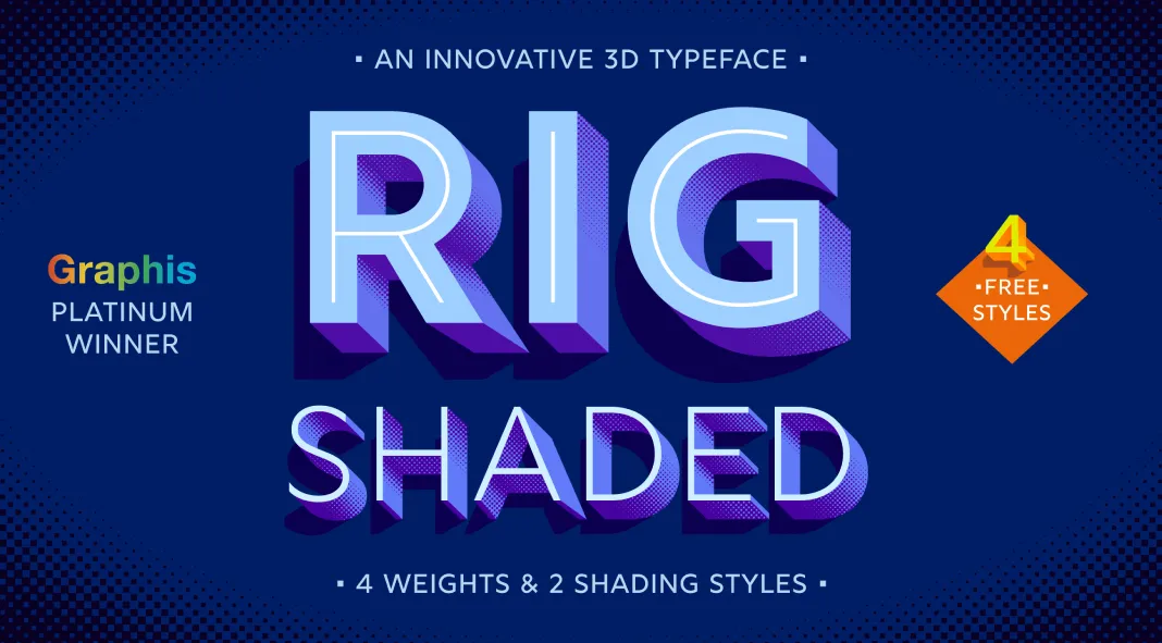
Designed and published by Jamie Clarke, Rig Shaded is an award-winning typeface. It’s a great fusion of geometric precision and dynamic 3D effects in contemporary typography. As the name suggests, Rig Shaded is like a framework crafted to bring a new dimension to visual communication.

Design and Structure
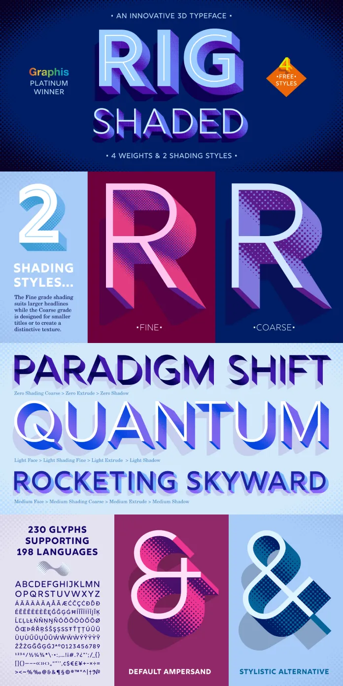
At its core, Rig Shaded is a geometric sans-serif typeface. However, what sets it apart is its integration of intricate 3D shading effects. Available in four versatile weights, including a distinctive “Zero Weight,” Rig Shaded offers designers a spectrum of options for creating depth and contrast in their work. Each weight is accompanied by two shading styles, Fine and Bold, which are designed to enhance the robust appearance of the font while maintaining clarity and readability.
The development of Rig Shaded was driven by a quest for the perfect letterforms that could seamlessly integrate shading while adhering to the principles of geometric design. Every character has been meticulously shaped to ensure maximum clarity and harmony when combined with 3D effects. The extruded and shaded styles have been handcrafted to maintain a consistent weight and tone across the entire typeface, resulting in a balanced and cohesive visual experience.
Versatility and Usage
Rig Shaded’s versatility is evident in its extensive character set, which includes 230 glyphs and supports 198 languages. This broad linguistic coverage makes it an excellent choice for international projects, catering to Western, Central, and Southeastern European languages, among others.
The font’s unique characteristics make it particularly suitable for branding, poster design, and any project that demands a striking, three-dimensional appearance. The fine and bold raster shadings provide flexibility, allowing designers to experiment with different visual effects while maintaining the integrity of the font’s geometric roots.
Practical Considerations
One aspect to consider when working with Rig Shaded is the level of detail in its shading styles. While these intricate details contribute to the font’s distinctiveness, they may also result in slower processing times in certain applications, especially in complex design projects or when working with large text blocks. This is a minor trade-off for the impressive visual impact that Rig Shaded delivers.
Rig Shaded by Jamie Clarke is not just a typeface; it’s a dynamic tool for designers looking to push the boundaries of traditional typography. Its combination of geometric precision, extensive language support, and striking 3D effects make it a standout choice for any project requiring a bold and modern aesthetic. Whether you’re purchasing individual weights or the entire family, Rig Shaded offers a unique blend of innovation and craftsmanship that is sure to elevate your design work.
For those interested in exploring the full potential of Rig Shaded, including additional design features, examples, and usage tips, purchasing the complete font family is highly recommended. Despite the slight processing trade-off due to its detailed shading styles, Rig Shaded is a worthy investment for any designer looking to add a touch of depth and sophistication to their typography toolkit.
Feel free to find other trending typefaces on WE AND THE COLOR for different needs.
Subscribe to our newsletter!


