
This post contains affiliate links. We may earn a commission if you click on them and make a purchase. It’s at no extra cost to you and helps us run this site. Thanks for your support!
Amidst the labyrinth of typefaces that grace our digital and printed landscapes, there emerges a gem that seamlessly weaves together the threads of modernist aesthetics and pre-war Warsaw’s multiscript tapestry – introducing the Polin Sans font family from the innovative minds at Borutta Group’s foundry.
Conceived after years of contemplation, the brainchild of Mateusz Machalski and Ben Nathan is a testament to the marriage of modernist allure and the rich heritage of pre-war Warsaw. Machalski, drawing inspiration from Władysław Strzemiński’s Alphabet “a.r.,” embarked on a typographic odyssey that explored the geometric variants of Cyrillic alphabets, ultimately birthing the captivating Polin Sans.
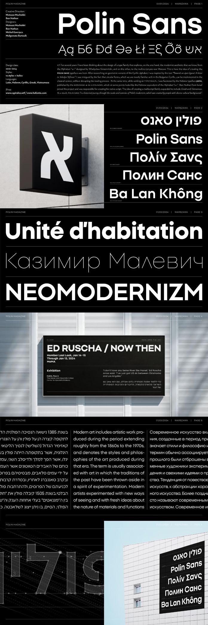
The Cyrillic exploration found its roots in the text “Towards an open layout: A letter to Volodya Yefimov,” a piece that illuminated the possibility of incorporating circular forms reminiscent of Bulgarian Cyrillic into the classical version without sacrificing readability. It’s this delicate balance between tradition and innovation that sets Polin Sans apart.
Collaborating with Ben Nathan, an expert in Hebrew script, the project gained an additional layer of depth. Nathan’s expertise, honed through his work on the Hebrew typeface Jaffa, published by the Idźkowski & Sk-a foundry, brought forth a striking resemblance to the Alphabet “a.r.” in Hebrew form. The fusion of these influences underscores the universal language of design that transcends cultural boundaries.
The Polin Sans family, however, didn’t stop at Cyrillic and Hebrew. The project’s scope expanded to encompass Greek and Vietnamese scripts, creating a harmonious multiscript family that takes the beholder on a historical journey through the nuances of Polish modernism. The result is a typeface that encapsulates the diverse cultural backgrounds of its creators and pays homage to the multicultural fabric of pre-war Warsaw.

With Michał Gorczyca and Małgorzata Bartosik lending their support, the Polin Sans family came to life. Each character is meticulously crafted, every curve and contour a testament to the dedication and passion of its designers.
Polin Sans isn’t just a font; it’s a narrative etched in letters. It’s a visual journey through time and culture, celebrating the convergence of diverse influences that shaped Polish modernism. In the hands of Machalski, Nathan, Gorczyca, and Bartosik, Polin Sans stands as a living testament to the harmonious coexistence of tradition and innovation in the realm of type design.
Feel free to find more recommended typefaces on WE AND THE COLOR.


