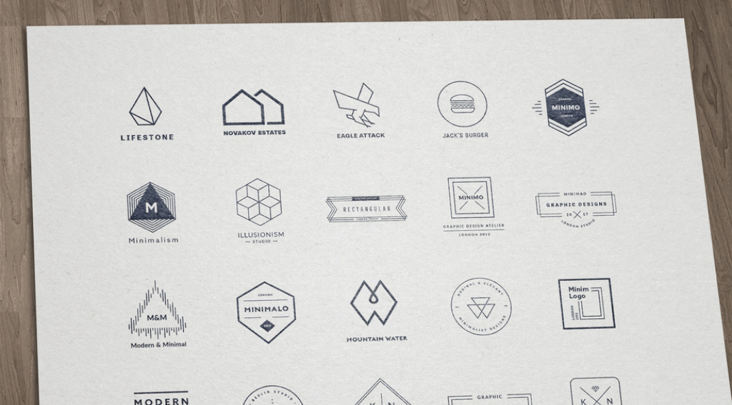
A brand’s logo often takes center stage in branding, where aesthetics and recognition reign supreme. It’s the visual emblem that encapsulates the brand’s essence, the symbol that instantly identifies it within a sea of competitors. But amidst the clamor for attention, it’s easy for logos to become cluttered, overdesigned, and ultimately, ineffective. This is where logo simplification steps in, wielding its transformative power to enhance brand recognition, longevity, and adaptability.
Decluttering the Visual Landscape
Imagine a crowded cityscape, with buildings towering over each other in a cacophony of colors and shapes. Now, picture a minimalist sculpture, standing tall and serene amidst the chaos. That’s the essence of logo simplification – stripping away unnecessary elements, refining shapes, and simplifying typography to create a clean, modern, and memorable logo.
Why Simplicity Matters
In today’s digital age, where logos are constantly resized, distorted, and viewed on various devices, simplicity becomes paramount. A cluttered logo can easily become illegible or lose its impact when shrunk down for use on mobile devices or social media platforms. Conversely, a simplified logo maintains its visual impact regardless of size or format.
The Benefits of Simplicity
The benefits of logo simplification extend far beyond adaptability. A simplified logo is easier to remember and recall, making it more effective at establishing brand recognition. It’s also more adaptable to different branding applications, from print to digital and from apparel to packaging. Additionally, a simplified logo projects a more modern and contemporary image, aligning brands with the current design trends and sensibilities of their target audience.
The Simplification Process
The process of logo simplification involves careful consideration and refinement. First, identify the key elements that define the brand and its values. Focus on these elements while removing unnecessary details. Next, simplify shapes and outlines, maintaining the overall form and silhouette of the logo. Use clear, consistent typography with a limited number of fonts and weights. Refine the font style and ensure proper spacing. Finally, limit the color palette to a few key colors that represent the brand’s identity. Avoid using excessive colors or complex color gradients.
Examples of Successful Logo Simplification
Numerous brands have successfully undergone logo simplification, reaping the rewards of a more effective and timeless visual identity. Apple’s iconic logo, once a complex design filled with intricate lines and gradients, has been refined into its current minimalist form, instantly recognizable and universally appealing. Similarly, the Nike ‘swoosh’ logo, once a stylized outline of a wing, has been stripped down to its essential form, maintaining its iconic status while becoming more versatile.
To sum it up, logo simplification is not just a design trend; it’s a strategic approach to a brand identity that enhances memorability, adaptability, and modernity. By embracing simplicity, brands can create logos that resonate with their target audience across various platforms and over time, ensuring their visual identity remains as timeless as the brand itself.
Header image by Amito Vectors via Adobe Stock. Don’t hesitate to explore some creative work in the Graphic Design and Branding sections on WE AND THE COLOR.


