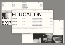
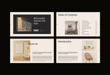
Mano a Mano’s primary objective for this project was to develop a branding that represents minimalism and modularity. This approach aimed to create a powerful and memorable communication outcome.
During the project, the team utilized a modular design methodology, which promotes adaptability and flexibility. This approach ensures that the area can be easily altered to cater to various needs and potential expansion, resulting in a versatile environment that can adapt to the evolving demands of Hinterland clients.
Taking inspiration from timeless aesthetics, the creators opted for a classic dark green hue, which is a symbol of elegance and tranquility and creates a sense of grounding throughout the project. This color choice fosters a serene ambiance and promotes a harmonious connection with nature.
A light blue hue was introduced to complement the dark green, creating a sense of openness and clarity. This particular shade of blue not only improves the visual appeal but also inspires a feeling of newness and freshness.
Strategically incorporating a pop of neon orange injects a vibrant energy and creates a bold statement. This electrifying color serves as an accent, drawing attention to crucial elements and contributing to the overall communication’s sense of dynamism and excitement.
Through the combination of minimalism, impactfulness, and modularity, a distinctive architectural design communication has been created that surpasses traditional boundaries.
Below you can see some images of the project. For more, please visit Mano a Mano’s website or follow them on Behance.

All images © by Mano a Mano. Do not hesitate to find more trending projects in the Graphic Design and Branding categories on WE AND THE COLOR.
Subscribe to our newsletter!


