This post contains affiliate links. We may earn a commission if you click on them and make a purchase. It’s at no extra cost to you and helps us run this site. Thanks for your support!
Astire Klarish – A Timeless Elegance Revived
Astire Klarish is a remarkable addition to the world of typography, seamlessly blending the nostalgic charm of retro serifs with a modern twist. This font stands as a testament to the synergy of classic and contemporary design, captivating designers and readers alike with its clean and soft lines, intricate curves, and the fusion of regular and italic variations.
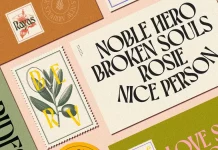
One of the standout features of Astire Klarish is its ability to effortlessly adapt to various contexts and sizes. In both expansive layouts and more intimate settings, the typeface preserves its elegance, making it a versatile choice for a plethora of design needs. Whether you’re crafting invitations, labels, logos, magazines, books, or greeting cards, Astire Klarish maintains its distinct character while effortlessly harmonizing with different design elements.

The marriage of regular and italic versions in Astire Klarish is where its true magic lies. This duality adds depth and dimension to the font, ensuring that it remains captivating and visually engaging in every usage scenario. The italic version brings a sense of movement and grace, allowing designers to emphasize certain words or phrases in a way that feels natural and unforced.
Astire Klarish is not just a typeface; it’s a design tool that embodies both trendiness and timeless elegance. The meticulous attention to detail is evident in the tight curves and meticulous shapes, which contribute to the font’s overall sophistication. Its versatility shines through in the diversity of applications it suits impeccably – be it on packaging, fashion-related materials, stationery, novels, or any advertising endeavor. This typeface seamlessly elevates the visual identity of any project it graces.
Furthermore, Astire Klarish’s exceptional legibility ensures that it transcends its aesthetic appeal. The characters are carefully crafted to guarantee optimal readability, even in smaller sizes and intricate compositions. This makes it a reliable choice for extensive editorial layouts, where content needs to be delivered with clarity and elegance.
In conclusion, Astire Klarish emerges as a definitive winner in the world of typography, seamlessly merging retro aesthetics with a contemporary touch. Its clean and soft lines, paired with the combination of regular and italic versions, result in a font that’s versatile, elegant, and captivating. Whether you’re a seasoned designer or a creative enthusiast, Astire Klarish offers a diverse range of applications, making it an indispensable asset in your design toolkit. This font is not just a passing trend; it’s a classic in the making.
Feel free to find more font reviews on WE AND THE COLOR.
Subscribe to our newsletter!


