Felipe Corrêa Holman doesn’t design cans. He designs the seconds before someone reaches for one. That distinction sits at the center of Solspill, a premium hydration brand built by Holman\Design® that turns a familiar category problem into a genuinely useful beverage branding case study. Most hydration drinks split into two lanes: clinical performance products or forgettable, generic bottles. Solspill refuses both lanes, and the reasoning behind that refusal is worth unpacking slowly.
I spent real time with this project, not skimming the press kit but tracing every decision back to its logic. Strategy, packaging, photography, and digital rollout all connect through one thread. That thread is what makes this beverage branding case study transferable to other categories, not just hydration.
Why Does Hydration Branding Need a New Playbook?
Sports drinks built their visual language around performance. Sharp angles, aggressive typography, and clinical color systems dominate the shelf. Consequently, every new entrant inherits the same visual vocabulary, whether the product needs it or not. Meanwhile, generic hydration brands went the opposite direction, leaning on plain minimalism that reads as safe but forgettable.
Solspill’s founder noticed a gap during travel: some drinks felt woven into a moment, while others felt like a transaction. That observation became the strategic seed. Holman translated it into a brand that treats hydration as an experience, not a fix. This is the first reason the project functions as a strong beverage branding case study: the insight came from lived behavior, not a mood board.
The Moment Integration Model
I’m naming this framework the Moment Integration Model, an editorial construct I use to describe how Solspill avoids the trap of pure functionality. Instead of asking “What does this drink do?” the model asks, “What moment does this drink belong to?” Every design decision, from can shape to photography, gets filtered through that second question.
Strategy Before Aesthetics
Solspill’s positioning statement moves the brand away from sports performance and closer to contemporary lifestyle beverages. Authenticity, connection, and energy became the three values guiding every downstream decision. As a result, the brand can flex across gyms, city walks, and social gatherings without losing coherence. That flexibility is rare in beverage branding, where most companies commit to one narrow occasion.

A Dual Benefit Ledger
I’ll call this second framework the Dual Benefit Ledger. On one side sits function: electrolytes, minerals, vitamins, and light carbonation. On the other side sits emotion: belonging, self-expression, and social ease. Solspill balances both columns instead of picking one, which explains why the brand reads as premium rather than purely medicinal. This balance is precisely what separates a strong beverage branding case study from a routine packaging refresh.
How Does the Visual Identity Avoid Category Clichés?
The logo uses fluid, organic shapes instead of literal water drops or lightning bolts. That choice matters more than it looks. Literal symbols age fast and limit flexibility. Fluid shapes, however, suggest movement without pinning the brand to one visual cliché.
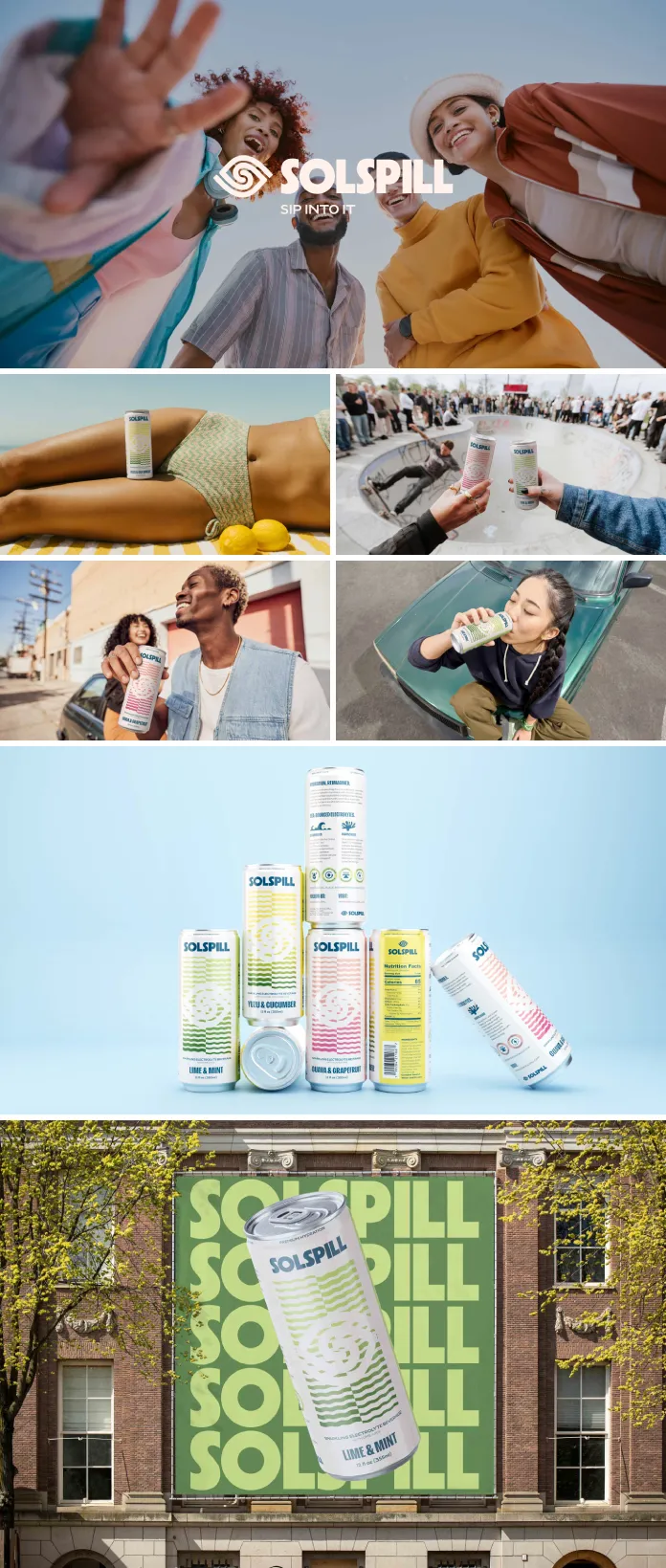
Color strategy followed a similarly disciplined process. Holman audited competing beverage brands first, mapping which palettes had already saturated the category. Solspill’s final palette blends warm and cool tones deliberately, creating contrast that supports both flavor differentiation and shelf visibility. Typography stays clean and structured, which keeps the system legible even when packaging gets busy with seasonal flavors or limited releases.
Packaging as the Real Battleground
In beverage branding, the can carries the entire argument. There’s no storefront, no salesperson, and often no second glance. Holman explored two creative routes before settling on the final direction: one leaning organic and natural, another pushing bolder, more graphic compositions. Testing both routes first is what gave the final can its confidence.
The Cold Case Contrast Index
I’m introducing a third framework here: the Cold Case Contrast Index. It measures how quickly a can registers visually inside a crowded refrigerated case, using hierarchy, color blocking, and negative space as its three variables. Solspill scores well because key information stays readable from a distance, while the composition still feels expressive up close. Few case studies in beverage branding document this shelf-level thinking so explicitly.
Why Does Photography Do So Much Strategic Work?
Most beverage brands treat photography as an afterthought, bolted on after packaging ships. Solspill did the opposite. Photography direction prioritized people, motion, and context over static studio shots. The can appears in hands, on tables, inside bags, mid-conversation, mid-travel.
This choice reinforces the Moment Integration Model directly. A product photographed only on a white background reads as function. A product photographed inside real life reads as identity. Therefore, photography becomes strategy, not decoration, which is a detail too many case studies skip entirely.
The Shelf-to-Screen Legibility Test
Here’s my fourth and final named framework: the Shelf-to-Screen Legibility Test. A modern beverage brand has to perform in two unrelated environments simultaneously. On a physical shelf, it competes against dozens of neighbors under fluorescent light. On a screen, it shrinks into a thumbnail, a story frame, or a grainy user photo.
Solspill’s can passes both tests. The hierarchy holds at arm’s length in a store aisle, and it still holds at twelve pixels tall on a phone screen. That dual performance requirement is becoming the real benchmark for premium hydration branding, not just aesthetic preference.
Solspill at a Glance
| Element | Strategic Role | Design Outcome |
|---|---|---|
| Brand Positioning | Lifestyle-integrated hydration, not sports performance | Flexible across gym, travel, and social occasions |
| Logo | Suggest flow and connection without literal symbols | Fluid, organic mark with scalable applications |
| Color System | Differentiate from saturated category codes | Warm and cool contrast for flavor and shelf visibility |
| Packaging | Perform on-shelf and on-screen simultaneously | Balanced hierarchy, color blocking, negative space |
| Photography | Show product inside real moments, not studio isolation | Lifestyle-first imagery across social and marketing assets |
| Digital System | Keep physical and online brand experience aligned | Templates, style guide, and social layout consistency |
What This Case Study Predicts for Beverage Branding
Premium hydration will keep splitting further from sports nutrition over the next few years. Brands that still lean on clinical, performance-only language will struggle against lifestyle-positioned competitors. Consequently, expect more beverage brands to invest in photography direction as a strategic line item, not a marketing afterthought.
I also expect the Shelf-to-Screen Legibility Test to become an informal industry standard, even if nobody calls it that yet. Packaging that only works in one environment will start to look outdated fast. Solspill’s approach, treating strategy, identity, and packaging as one connected system, offers a clear blueprint for founders entering an increasingly crowded hydration market.
Frequently Asked Questions
What is Solspill’s core brand positioning?
Solspill positions itself as a lifestyle-integrated hydration brand, blending functional benefits like electrolytes and minerals with emotional benefits like belonging and self-expression.
Who designed the Solspill brand identity?
Felipe Corrêa Holman of Holman\Design® led the full beverage branding case study, covering strategy, visual identity, packaging, and digital applications.
Why does Solspill’s can design matter beyond aesthetics?
The can had to perform on physical shelves and digital screens at once, which shaped every decision around hierarchy, color blocking, and negative space.
What makes this a useful beverage branding case study for other founders?
It documents a full system, from strategy through packaging through photography, rather than isolating one design element from the rest.
How does Solspill differ from traditional sports drinks?
Sports drinks emphasize performance and recovery. Solspill emphasizes moments and identity, expanding its relevance beyond gyms into travel and social settings.
All images © Holman\Design®. Check out WE AND THE COLOR’s Graphic Design and Branding categories for more.
Subscribe to our newsletter!