
This architecture project shows what an average-sized city apartment can truly offer. We often think about interior design in terms of nice furniture or trendy wall colors. But what happens when you go deeper? What if design means rethinking the very bones of the place – the layout, the structure, even how the pipes and wires run? This Prague apartment transformation by the talented team at No Architects shows us it can offer way more than you might expect.
Think about the typical Czech apartment. The 2021 census tells us the average size is about 86.7 square meters. Usually, that gets you around 2.9 living rooms plus a kitchen. Then you have the other bits: hallways, bathrooms, toilets – often just seen as spaces you pass through. But here’s a thought: what if every part of your home was treated as valuable living space? Could we cleverly connect how we live, even if it means doing things a bit differently? Is it actually possible to balance practical needs like storage and daylight with a feeling of openness, character, and maybe even a little poetry? No Architects decided to find out.
They took an apartment slightly below average size, just eighty-two square meters. Then, they focused entirely on maximizing its living potential. The result? It’s astonishing. After their work, this apartment feels less like a flat and more like a compact family house. Seriously, it packs in what feels like up to 11 distinct areas! Let’s count them:
- An entrance hall that actually gets daylight.
- A long central hallway, cleverly designed with a spot to sit.
- Two children’s rooms (with comfy sleeping for three kids!).
- Two bathrooms (yes, two!).
- A separate toilet room that also includes storage.
- A kitchen featuring a dining area big enough for eight people.
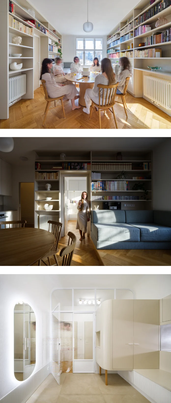
- A living room complete with a seriously impressive library space.
- A dedicated work area within the living space.
- The parents’ bedroom.
- A home sauna (imagine that luxury during Prague winters!).
- Naturally, there is also a practical dressing room that doubles as storage and a laundry area.
All of this fits neatly behind the front door of a typical apartment in one of Prague’s many century-old buildings. Yet, despite being filled with function, it doesn’t feel cramped or like a soulless storage unit. No Architects insisted on keeping a sense of generosity and paying attention to those beautiful, honest details. They believe in poetics – that special quality that turns a mere building into something more meaningful than just an investment. This specific Prague apartment transformation is a testament to that belief. Read more below. The following images were shot by Studio Flusser.
Overcoming the Limits of a Standard Prague Apartment Layout
Architects often encounter a common challenge in older apartment buildings: the “three-tract” layout. Picture this: four load-bearing walls creating three main sections running front to back. Usually, the two outer sections get windows, facing the street or courtyard. But that middle section? It often ends up dark, stuffy, and cut off, serving as a windowless hallway or service space. It lacks flexibility. You can’t easily create openings, enjoy views across the apartment, or move freely.
That’s exactly the situation No Architects faced here. The original apartment had a large, pitch-black central hallway with no natural light. You entered directly from the building’s often cold and dim staircase landing. Imagine stepping inside, maybe tracking in mud, and then having that dark corridor lead off to all the rooms. Some rooms felt too big, others too small, and there simply weren’t enough of them for the new residents – a young family needing distinct spaces. This common setup needed a radical rethink for this Prague apartment transformation.

A Bold Prague Apartment Transformation Strategy: Rethinking Flow
So, how did No Architects tackle this puzzle? Interestingly, they started by seemingly wasting space. They carved out a completely new, long communication corridor right down the middle of the apartment. They even made it longer than strictly necessary, rounding its ends and incorporating built-in seating and storage along its length. This wasn’t just a hallway; it became a feature, a central spine for the home.
Furthermore, to create a sense of arrival and keep the main living areas cleaner, they separated the apartment entrance from this main corridor with a distinct entrance hall. Cleverly, they brought daylight into this entrance area in two ways: directly through a strategically placed opening above the kitchen unit and indirectly through a large glass wall.
Next, they reorganized the rooms around this new central axis. The children’s rooms were positioned to face the quieter courtyard. Conversely, the parents’ bedroom and the integrated work area were oriented towards the street. The kitchen now features a welcoming window looking back into the entrance hall, promoting a sense of connection, but its heart is a large, round dining table perfect for family meals and gatherings.
The living area received special treatment. It’s elevated slightly on a platform near the window, nestled between two substantial bookcases. This setup not only defines the space but also offers flexibility – it can be converted into a large sleeping area for guests. Nearby, the master bathroom and the home sauna provide a touch of hotel-like comfort. This part of the Prague apartment transformation truly elevates daily living.
Crafting Character: Materials and Details in this Prague Apartment Transformation
The overall feeling of the renovated space is calm and cohesive. Beautiful oak flooring runs throughout the living areas. The walls are primarily dressed in soft shades of white and beige, creating a bright and airy atmosphere. But one detail really stands out: a continuous line of low wooden cladding runs along the walls.
Think of it as a kind of monumental baseboard or plinth. It’s recessed slightly into the walls, creating a subtle shadow line. What makes it special is how it seamlessly transitions into pieces of furniture – a bench here, a shelf there – and then flows back into being part of the wall cladding. This light, jagged line adds a layer of visual interest and connects the different elements of the design. It’s a perfect example of the attention to fine detail that prevents the space from feeling generic. This thoughtful materiality is key to the success of the Prague apartment transformation. It adds that essential ‘poetics’ No Architects strives for.
More Than Meets the Eye: A Hidden Feature
Remember that window between the entrance hall and the kitchen? It serves a practical purpose, sharing light. But it also holds a delightful secret. If you close the sliding door to the kitchen and cover this window with black paper that has a tiny pinhole in the middle, something magical happens. The window transforms into a camera obscura!
This simple setup acts like a primitive camera, projecting an upside-down image of the hallway onto the kitchen wall. It’s a playful, unexpected feature – a nod to the history of optics hidden within the architecture. It’s these little touches of ingenuity that make this Prague apartment transformation truly unique and memorable.
Lessons from No Architects: Rethinking Your Own Space
So, what can we learn from this remarkable project? It powerfully demonstrates that an average-sized apartment doesn’t have to feel average. When interior design moves beyond surface decoration and tackles fundamental layout challenges, the potential skyrockets. This apartment transformation proves that by cleverly integrating functional needs, structural solutions, and even technical infrastructure like ventilation and lighting, you can achieve surprising results.
Remember those initial questions? Can all parts of a home be equal? Can we connect daily activities organically, even in unusual ways? Can we find harmony between function, storage, light, and still create a space that feels generous, unique, and full of character? No Architects answers with a resounding “yes.”
Their approach wasn’t about cramming things in; it was about unlocking hidden potential. They showed that even a standard, somewhat awkward layout can be reimagined to support a rich family life, complete with spaces for work, relaxation, play, and even wellness (hello, sauna!). It encourages us all to look at our own spaces, no matter the size, and ask: could it offer more? Could a smarter layout make a world of difference?
This apartment transformation serves as fantastic inspiration. It shows the power of thoughtful architectural intervention. It highlights how maximizing apartment space often requires bold moves and creative apartment layout solutions, especially when transforming a small Prague apartment for a family.
Ultimately, this project stands as a beautiful example of how innovative design can elevate everyday life. It’s more than just a renovation; it’s a redefinition of what an 82-square-meter city apartment can be. It reminds us that good design considers not just aesthetics but the very essence of how we live, creating spaces that are not only functional but also filled with generosity and soul. Perhaps it’s time to look at your own home with fresh eyes?
All images © by No Architects and Studio Flusser. Feel free to browse WE AND THE COLOR’s Architecture and Interior Design categories for more.
Subscribe to our newsletter!


")


