
This post contains affiliate links. We may earn a commission if you click on them and make a purchase. It’s at no extra cost to you and helps us run this site. Thanks for your support!
Come with us on a typographic journey of elegance and rebellion with the JHC Audemars typeface.
Hey typo enthusiasts and font fanatics, today, we’re diving into the sizzling world of design rebellion, where Anwar Patihan takes the reins, steering us through the wild ride that is the JHC Audemars font family. Buckle up, because this isn’t your grandma’s serif font; this is a condensed masterpiece radiating a vibe that’s part resolute, part refined, and all-around cool.
Picture this: Anwar Patihan, the unsung hero of avant-garde typography, decides to flip the script on conventional letterforms. The result? The JHC Audemars font, a rebel with a cause, stands out in the crowd with its inverted letter shapes. Forget the norms; embrace the chaos. This is a font that doesn’t just play by the rules—it rewrites them.
Now, let’s talk weights. JHC Audemars isn’t just a one-trick pony. It’s got a comprehensive range of weights, from Thin to Black, making it the chameleon of fonts. Whether you’re going for a delicate dance or a bold statement, Audemars has your back. It’s the font that adapts to your mood, your project, and your vibe du jour.
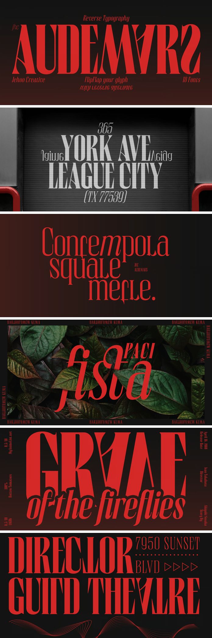
But wait, there’s more. Anwar Patihan didn’t stop at just messing with the letter shapes and weights. Oh no, he cranked it up a notch with an elegant italic style that’s smoother than a jazz sax solo. This isn’t your run-of-the-mill italic; this is the kind that adds a dash of sophistication, a sprinkle of rebellion, and a whole lot of “heck yeah” to your designs.
Now, why should you care about JHC Audemars? Well, imagine this: you’re crafting a brand that’s not just a brand; it’s a statement. Audemars steps in like the font superhero it is, effortlessly merging strength with sophistication. It’s the secret sauce for those who want their branding to be remembered long after the first glance.

And hey, editorial aficionados, listen up. Audemars isn’t just for the big and bold; it’s got the finesse to play in the editorial sandbox. Clear, legible, and oh-so-stylish, it’s the font that transforms your words into a visual symphony.
In a world where design often tiptoes the line between generic and forgettable, JHC Audemars flips the script. It’s not just a font; it’s a typographic rebellion, a middle finger to the mundane, and a high-five to those who dare to be different.
So, whether you’re a designer pushing the boundaries or a brand looking to make a splash, JHC Audemars is your partner in crime. It’s the font that doesn’t just speak; it roars, leaving an indelible mark on the canvas of creativity. It’s time to let Audemars be the rebel with a cause in your typographic toolbox—because being ordinary is so last season.
Feel free to find more recommended typefaces on WE AND THE COLOR.


