
This post contains affiliate links. We may earn a commission if you click on them and make a purchase. It’s at no extra cost to you and helps us run this site. Thanks for your support!
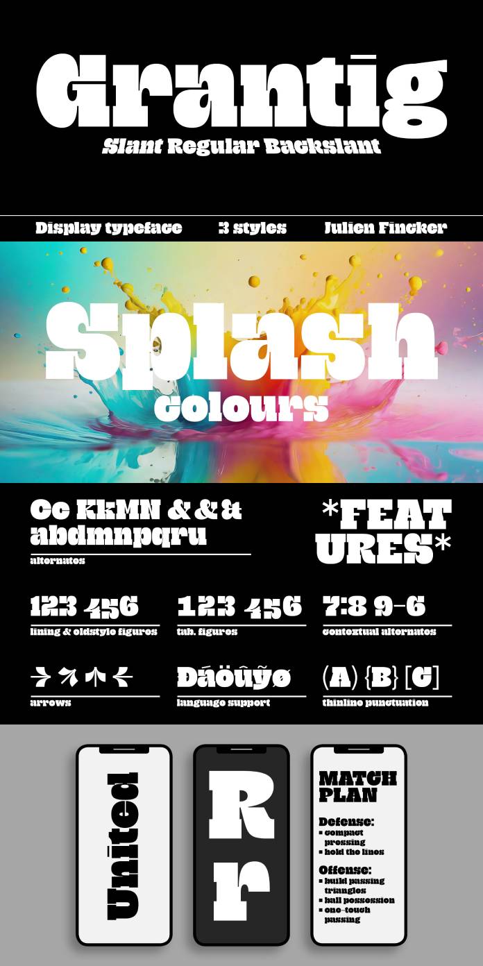
Typography is a powerful tool that can transport us to different eras, moods, and settings. Julien Fincker’s Grantig font does exactly that, taking inspiration from the opening titles of old Western movies and reinterpreting the classic Western slab serif typeface for the modern world. Grantig is a bold, expressive, and captivating display typeface with massive serifs and rounded curves that evoke the grumpy heroes of bygone Western tales. In this blog post, we’ll take a closer look at the Grantig font, exploring its unique features and versatility in design.
A Nod to the Western Genre
The Western genre has always held a special place in cinematic history. The opening titles of classic Western movies often featured bold, rugged typefaces that set the tone for the gritty and adventurous tales that would unfold on the screen. Grantig pays homage to this tradition while breathing new life into it.
Grantig’s massive serifs and rounded curves are a visual representation of the grumpy Western heroes who were often seen in the company of their leaning companions, Slant and Backslant. These design elements give the font a distinct character, reminiscent of characters like Clint Eastwood’s Man with No Name, who exuded a sense of tough resilience.
Versatility in Modern Design
While Grantig draws its inspiration from the past, it’s far from being confined to a single genre or era. Its adaptability makes it suitable for a wide range of applications in contemporary design.
- Headlines that Demand Attention: Grantig is particularly effective in creating eye-catching and type-accentuated headlines. Its bold and expressive nature ensures that any message you convey will not go unnoticed.
- Editorial, Packaging, and Advertising: This font is a versatile choice for editorial design, packaging, and advertising. Its unique personality can add an extra layer of visual interest to your projects, making them stand out in a crowded marketplace.
- Multilingual Support: With 482 characters, Grantig accommodates the language needs of many Latin-based languages. This multilingual support makes it a valuable asset for designers working on international projects.
- OpenType Features: Grantig is equipped with essential OpenType features such as lining and old-style figures, alternate characters, and arrows, allowing for greater creative flexibility and customization in your designs.
Limited-Time Offer
For those interested in incorporating Grantig into their projects, there’s even more reason to do so now. The font is currently available at a 60% reduced price on MyFonts until December 11th, 2023. This limited-time offer presents an excellent opportunity to acquire this unique and versatile typeface at a discounted rate.

The Grantig font by Julien Fincker is a bold serif display typeface that bridges the gap between the rugged heroes of old Western films and the demands of modern design. Its massive serifs, rounded curves, and distinctive character make it an ideal choice for creating captivating headlines, editorial pieces, packaging, and advertising materials. With support for various languages and essential OpenType features, Grantig offers designers the creative freedom to bring their ideas to life. Don’t miss the chance to explore the possibilities that Grantig offers, and take advantage of the limited-time offer to add this remarkable font to your design toolkit.
Feel free to find more recommended typefaces on WE AND THE COLOR.
Subscribe to our newsletter!


