
This post contains affiliate links. We may earn a commission if you click on them and make a purchase. It’s at no extra cost to you and helps us run this site. Thanks for your support!
The Calder Typeface Collection – An Artful Blend of Playful Elegance and Rugged Authenticity.
As an avid enthusiast of typography, I recently had the pleasure of exploring the Calder typeface collection, a remarkable creation by the talented designer Mariya Lish of Inhouse Type. This diverse collection is an artistic fusion of 10 unique styles that seamlessly combine a whimsical, semi-connected script and a selection of understated yet genuine sans serifs, each contributing to an engaging visual tool that captivates the imagination.
One of the standout features of the Calder typeface collection is its distinctive duality, offering two voices that complement each other with finesse. The playful semi-connected script exudes a sense of elegance, flowing gracefully with its semi-joined characters, lending an air of whimsy charm to any design project. Its versatility is further enhanced by its availability in both upper and lower case, granting designers the creative freedom to experiment and achieve their desired artistic vision.
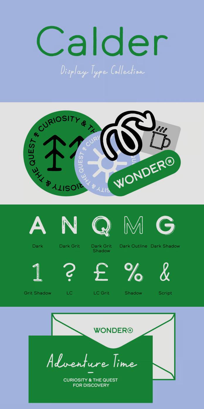
For those seeking a more refined and grounded aesthetic, the sans serif styles within the collection deliver in spades. The authentic sans serifs exude a subtle yet undeniable strength, striking a harmonious balance between simplicity and sophistication. Though available exclusively in upper case, these fonts retain their adaptability across a broad range of design applications, ensuring seamless integration with the script styles.
The inspiration behind the Calder font collection is as captivating as its design. Rooted in the pursuit of outdoor experiences, the collection is a personal expression of the designer’s journey to share the spirit of adventure with others. This passion is evident in the fonts’ distinctive characters, each bearing a hint of the wilderness and the call for exploration.
In practical terms, the Calder typeface collection is a versatile and powerful tool that suits various design projects, from branding and advertising to packaging and editorial work. Its cohesive blend of script and sans-serif styles opens up endless possibilities for designers, allowing them to effortlessly blend the playfulness of the script with the subtlety of the sans-serifs, creating engaging and visually captivating compositions.

Furthermore, the attention to detail in the design is evident, as each style possesses a flawless balance of legibility and artistry. The font’s readability is maintained even in the script styles, avoiding the common pitfalls of excessive flourishes that can sometimes hinder readability.
In conclusion, the Calder fonts by Mariya Lish of Inhouse Type stand out as an exceptional display typeface collection. With its 10 diverse styles, it harmoniously blends a playful, semi-connected script with a selection of authentic sans serifs. The combination of voices opens up a world of design possibilities while remaining true to its inspiration of the great outdoors and the spirit of adventure. Whether it’s evoking elegance, playfulness, or rugged authenticity, this collection proves to be an invaluable addition to any designer’s toolkit, offering an exceptional visual experience for both creators and viewers alike.
Feel free to find more recommended typefaces on WE AND THE COLOR.
Subscribe to our newsletter!


