This post contains affiliate links. We may earn a commission if you click on them and make a purchase. It’s at no extra cost to you and helps us run this site. Thanks for your support!
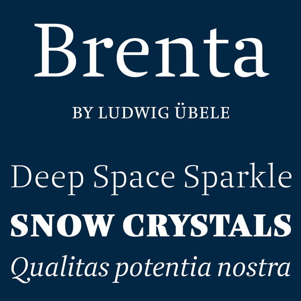
The Brenta font family, a crisp serif typeface by Ludwig Übele.
German graphic and type designer Ludwig Übele has created the Brenta font family in 2015. This family looks like a classic serif with open counters and well balanced proportions. Because of its crisp design caused by sharp edges and sturdy shapes, Ludwig Übele decided to use a name that refers to a range of mountains in northern Italy. Strong serifs and open terminals convey a sense of clarity and elegance. This easy to read family with its diverse weights and italic versions can be used for both headlines and text.
A very special feature of the Brenta font family is a set of alternate stencil characters. But that’s not all! Ludwig Übele has equipped this family with a range of helpful OpenType features such as ligatures, superiors and inferiors, tabular figures, fractions, and many more. Brenta is available as both webfont and conventional desktop font.


The Brenta font family by Ludwig Übele is available for purchase here.
Check out more fonts on WE AND THE COLOR.


