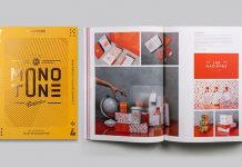
Color is having a moment. Not a quiet, understated moment — a full-volume, no-apologies statement. Right now, the design world sits at a rare intersection: one where fantasy, luxury, and digital rebellion collide inside a single palette. The color combinations in graphic design surfacing this year feel less like aesthetic choices and more like cultural declarations. They tell you exactly what a brand believes, who it wants to attract, and how boldly it intends to show up.
So what are the three color pairings that every serious designer is reaching for right now? And more importantly, why are these combinations resonating so deeply in 2026?
This article breaks it down — with original frameworks, forward-looking analysis, and honest opinions from someone who spends a lot of time watching how color moves through culture.
What Makes a Color Combination Truly Trendsetting in 2026?
Not every color pairing earns the word “trendsetting.” Plenty of combinations look fine. Some look polished. But only a rare few actually feel inevitable — like the culture was always heading toward them.
Introducing the Chromatic Tension Index
To evaluate color combinations in graphic design, it helps to have a framework. The Chromatic Tension Index (CTI) is a lens that this article introduces to assess exactly that. It measures three things: the contrast distance between hues, the saturation energy of the pairing, and the cultural resonance the combination carries at a specific moment in time.
A high CTI score means the combination creates strong visual electricity. It arrests the eye and demands a response. A low CTI score means the palette reads as background — comfortable but forgettable. The three trending color combinations in graphic design this year all score exceptionally high on the CTI scale. Furthermore, they each reflect one of three major forces shaping visual culture right now.
Three Forces Driving Color in 2026
The first force is escapism. After years of quiet luxury and muted neutrals, audiences actively crave fantasy. They want design that transports them somewhere else. The second force is polarity. Extreme contrast — between dark and light, synthetic and organic, loud and restrained — creates visual tension that social media rewards. The third force is the phygital pull. Designers increasingly work in spaces between the physical and digital worlds. Consequently, color combinations that feel simultaneously tactile and screen-native are winning in both contexts.
These three forces directly map onto the three trendiest color combinations in graphic design this year.
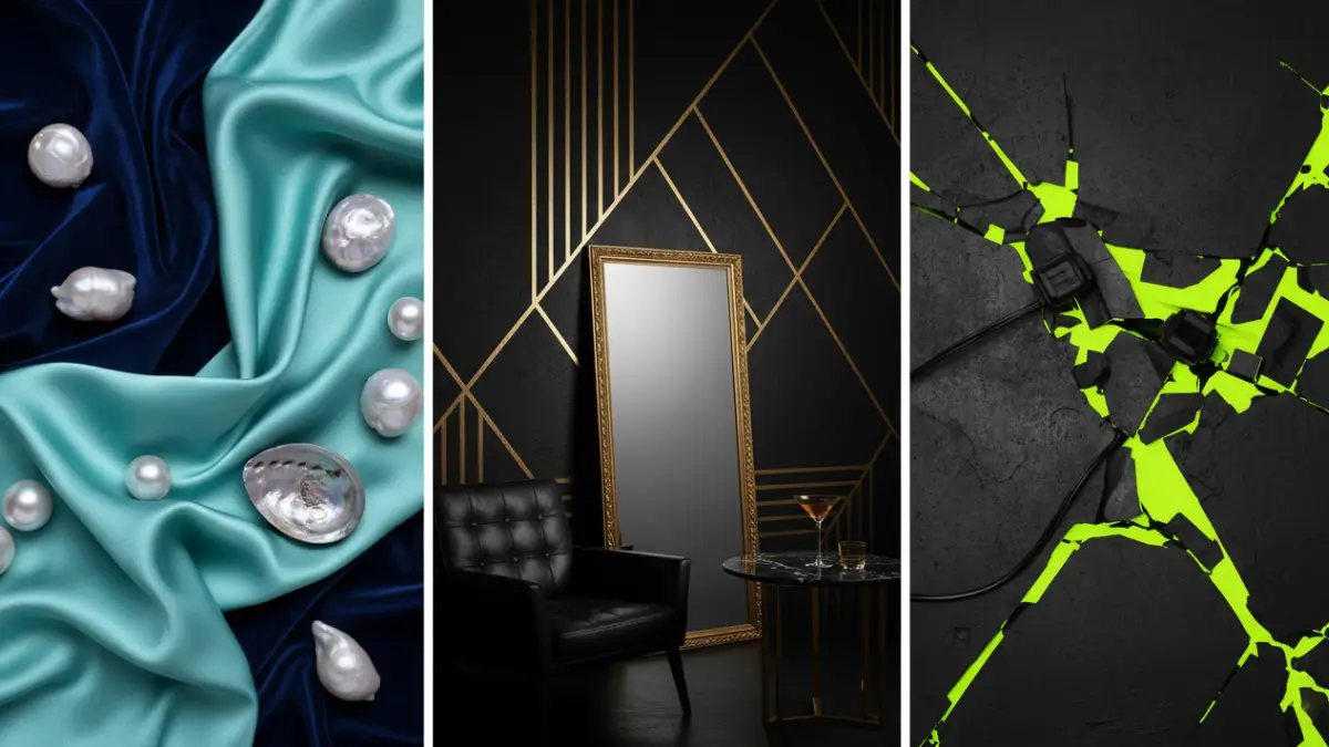
1. Mermaidcore: Iridescent Aqua + Pearlescent Purple + Midnight Blue
If there is one color combination in graphic design that captures the full spirit of 2026, it is Mermaidcore. This palette captures the shimmer and mystery of the ocean with iridescent aquas, soft teals, pearlescent purples, and glittery silvers that create dreamy, fluid compositions. Paired with deep midnight blue as an anchor, the result feels both otherworldly and immediately desirable.
It is not just pretty. It is strategically precise.
Why Mermaidcore Works Right Now
Mermaidcore resonates because it delivers exactly what audiences crave: escapism without sacrificing sophistication. It marks a shift away from the muted “quiet luxury” neutrals of recent years and brings back bold fantasy with a touch of glamour. Designers who have watched the “beige era” of branding dominate for half a decade will recognize this as a direct correction.
Crucially, Mermaidcore is not nostalgia. The palette draws from iridescence — from the way OLED screens render light, from holographic finishes in premium packaging, from the specific quality of deep-sea bioluminescence. These colors mimic the depth of deep-sea creatures and OLED screens, used as gradients on dark backgrounds in graphic design. That combination of nature and technology is precisely the phygital pull described earlier.
Think of it as Phygital Palette Theory in action: color combinations that feel at home both on a foil-stamped print piece and on a glowing phone display simultaneously.
How to Apply Mermaidcore in Graphic Design
The strongest applications of this color combination pair iridescent aqua (#00CED1 range) and pearlescent violet (#8A2BE2 range) against a foundation of midnight blue (#191970 range). The key is movement. Static flat applications lose the point entirely. Instead, designers should use gradient transitions, translucent overlays, and layered metallic finishes to replicate that signature light-on-water shimmer.
Beauty brands, spa identities, luxury tech packaging, and premium lifestyle apps are already leaning hard into this palette. Furthermore, Mermaidcore color combinations in graphic design work particularly well for brands targeting audiences who actively reject hyper-realistic, AI-generated aesthetics in favor of something that feels crafted and intentional.
Long-tail application: For UI design, try a midnight blue base (#1A1A2E) with aqua teal CTAs (#00BFBF) and pearlescent gradient hero sections transitioning through lavender (#B57BEE) to silver-white (#E8E8FF). The visual depth is exceptional.
2. Clubroom Contrast: Deep Inky Black + Metallic Gold
Some color combinations in graphic design do not need to be innovative. They simply need to execute with total conviction. Clubroom Contrast — deep inky black paired with metallic gold — falls squarely into that category. Few palettes say “luxury” like black and gold. Clubroom Contrast combines deep inky backdrops with metallic gold accents to create instant drama and sophistication.
This is not a new combination. But the way it is showing up in 2026 is new.
Luxury Polarity: The Framework Behind This Pairing
Introducing Luxury Polarity: the design principle that maximum tonal contrast between two colors — specifically between near-absolute black and warm metallic gold — generates the highest possible perception of premium value. This works because the human eye reads extreme contrast as intentionality. It signals that nothing happened by accident.
This trend evolves from popular minimalist “all-black” palettes, adding a new layer of opulence. Where stark black once represented exclusivity through restraint, pairing it with gold is now a sign of confidence, indulgence, and high-impact luxury.
The distinction from previous black-and-gold applications is texture. In 2026, designers apply this combination through matte foils, brushed gold finishes, gradient metallics, and rich embossing — rather than flat digital gold tones that dominated earlier iterations. The contrast between matte black and shimmering gold creates a tactile depth that photographs exceptionally well and reads powerfully across both print and digital channels.
How to Use Clubroom Contrast in Design
For digital applications, deep inky black (#0D0D0D or #1A1108 for warmth) paired with a gold at approximately #C9A84C creates the right weight. Avoid pure yellow-golds; they read as cheap. Instead, target muted, slightly desaturated golds that carry warmth without brightness.
This color combination in graphic design performs best for spirits brands, high-end hospitality, premium menswear, financial services, and luxury automotive. Accordingly, for packaging design, this pairing benefits enormously from tactile finishing: spot UV, foil stamping, and embossed texture differentiate the execution from competitors working in the same palette.
Long-tail application: For social media content design, place bold condensed sans-serif typography in metallic gold against a full-bleed deep black background. Add a single thin gold rule as a divider. The result is instantly recognizable, scroll-stopping, and eminently shareable — all without requiring any illustration or photography.
One personal observation worth noting: the brands executing Clubroom Contrast best in 2026 are the ones showing restraint. Gold as punctuation, not wallpaper. That discipline is what separates truly effective color combinations in graphic design from those that simply look expensive.
3. Neon Shock: Acid Green + Electric Yellow + Industrial Black
Here is where things get genuinely interesting. While Mermaidcore offers fantasy and Clubroom Contrast delivers luxury, the third trending color combination in graphic design this year offers something entirely different: confrontation.
Neon Shock is about using neon as a highlight rather than flooding your branding with fluorescent color. Electric greens, acid yellows, and hot pinks energize palettes with muted or industrial foundations, acting as bold exclamation marks throughout your branding.
Why Neon Shock Is More Than Just Bold Color
The cultural logic behind Neon Shock is rooted in the attention economy. Digital scroll speeds have accelerated. Algorithmic content feeds reward the visually unexpected. Consequently, brands that once played it safe with neutral palettes are reconsidering whether “safe” is actually the higher risk.
In 2026, neon is more refined and used sparingly to add energy and impact. It reflects how brands are learning to balance attention-grabbing color with readability and restraint, creating designs that pop without exhausting the eye.
This is a critical distinction. Neon Shock is not the all-over fluorescent assault of the early 2020s. Instead, it deploys neon with surgical precision: a single acid green (#AAFF00 range) slash across a matte black composition, or an electric yellow (#FFE000) typographic highlight against a charcoal industrial grid. The industrial black acts as a pressure valve — it absorbs the intensity of the neon and makes the combination feel controlled rather than chaotic.
Unexpected combinations like chocolate brown with sky blue, grass green with baby pink, or grey with acid orange help design feel current and unique. If a pairing feels “wrong,” it might actually be right on trend. Neon Shock operates on exactly this logic.
The CTI Score for Neon Shock
Returning to the Chromatic Tension Index, Neon Shock scores the highest CTI of the three combinations covered in this article. The contrast distance between acid green and industrial black is near-maximum. The saturation energy of the neon hues is extreme. And the cultural resonance — anchored in gaming aesthetics, Gen Z visual language, music event design, and tech startup branding — is sharply relevant in 2026.
How to Apply Neon Shock in Graphic Design
The starting palette: industrial matte black (#0F0F0F), acid green (#B5FF00), electric yellow (#FFEA00), optionally punctuated with hot pink (#FF2D78) as a tertiary accent. Use acid green for primary CTAs, headlines, or brand marks. Reserve yellow for supporting information or highlights. Keep the overall composition predominantly black — roughly 70% of the design space.
This color combination in graphic design thrives in event branding, music and entertainment identities, gaming platforms, activewear, and youth-facing tech products. Additionally, editorial designers increasingly apply it to magazine spreads and book covers where visual disruption drives attention.
Long-tail application: For packaging design, apply a matte black structural substrate with a full-bleed acid green label element. Use a stark, geometric sans-serif in black reversed out of the green panel. The resulting contrast creates strong shelf differentiation and photographs exceptionally well against both neutral and complex backgrounds.
The Future of Color Combinations in Graphic Design
These three palettes — Mermaidcore, Clubroom Contrast, and Neon Shock — do not exist in isolation. Together, they reveal a broader thesis about where color is heading.
The thesis: 2026 is the year that color combinations in graphic design stopped being about preference and started being about position. Every palette a brand chooses now communicates not just aesthetic taste, but cultural alignment, audience targeting, and competitive differentiation. Mermaidcore says: We believe in wonder and craft. Clubroom Contrast says: We operate at a level that requires no explanation. Neon Shock says: We refuse to be ignored.
What to Expect Next
Looking ahead, the convergence of these three trends suggests a fourth emerging direction: high-contrast color combinations that blend the fantasy of Mermaidcore with the precision of Neon Shock. Think iridescent aqua on near-black, with acid yellow as a punctuation accent. This Bioluminescent Clash combination does not yet have widespread adoption, but the visual logic is already appearing across motion design, AI-generated art, and experimental brand identities.
Furthermore, as Pantone’s 2026 Color of the Year — Cloud Dancer, a shade of white described as having a “calming influence” — continues to anchor neutral-leaning design systems, expect a growing aesthetic tension between Cloud Dancer-based minimalism and the expressive boldness of all three palettes covered here. That tension will produce some of the most interesting color work of the next 18 months.
Watch for it.
FAQ: Color Combinations in Graphic Design 2026
Q: What are the three trendiest color combinations in graphic design in 2026?
A: The three most dominant color combinations right now are Mermaidcore (iridescent aqua, pearlescent purple, and midnight blue), Clubroom Contrast (deep inky black and metallic gold), and Neon Shock (acid green, electric yellow, and industrial black). Each serves a distinct brand positioning strategy and appeals to different audience segments.
Q: Why are neon color combinations trending again in 2026?
A: Neon is returning, but in a more disciplined form than previous cycles. The attention economy rewards visual disruption, and brands increasingly recognize that restrained neon accents on dark or muted foundations create high-contrast, scroll-stopping designs without overwhelming the viewer. The key is using neon as punctuation rather than as wallpaper.
Q: What is the Chromatic Tension Index (CTI)?
A: The Chromatic Tension Index is a framework introduced in this article to evaluate the visual energy of a color combination. It assesses three factors: contrast distance between hues, saturation energy of the pairing, and cultural resonance at a specific moment in time. High CTI combinations create strong visual electricity and audience engagement.
Q: Which industries are adopting Clubroom Contrast (black and gold) most in 2026?
A: Premium spirits, luxury hospitality, high-end financial services, premium menswear, and luxury automotive brands are the most active adopters. The palette signals exclusivity and confidence, making it ideal for any brand pursuing premium market positioning.
Q: How does Mermaidcore differ from previous iridescent or holographic design trends?
A: Unlike the flat, graphic holographic trends of the mid-2010s, Mermaidcore specifically combines deep ocean-inspired blues as anchoring foundations with layered iridescent gradients and translucent finishes. It draws on both bioluminescence and OLED display aesthetics, making it feel simultaneously natural and technologically sophisticated — a key distinction for 2026 design sensibilities.
Q: What is Phygital Palette Theory?
A: Phygital Palette Theory is a concept introduced in this article describing color combinations that function effectively across both physical (print, packaging, signage) and digital (screens, UI, social media) applications simultaneously. The best 2026 color combinations in graphic design score high on phygital performance, meaning they translate with equal impact from printed foil to an OLED display.
Q: Will these color combinations in graphic design still be relevant in 2027?
A: Mermaidcore and Clubroom Contrast have sufficient cultural depth and versatility to extend well into 2027 and beyond. Neon Shock, by contrast, tends to cycle faster due to its close relationship with fast-moving youth culture and social media aesthetics. The emerging “Bioluminescent Clash” direction — combining deep dark backgrounds with iridescent and neon accents — represents the likely next evolution of these trends.
Check out other creative topics and inspiring projects in the Graphic Design section here at WE AND THE COLOR.

