This post contains affiliate links. We may earn a commission if you click on them and make a purchase. It’s at no extra cost to you and helps us run this site. Thanks for your support!
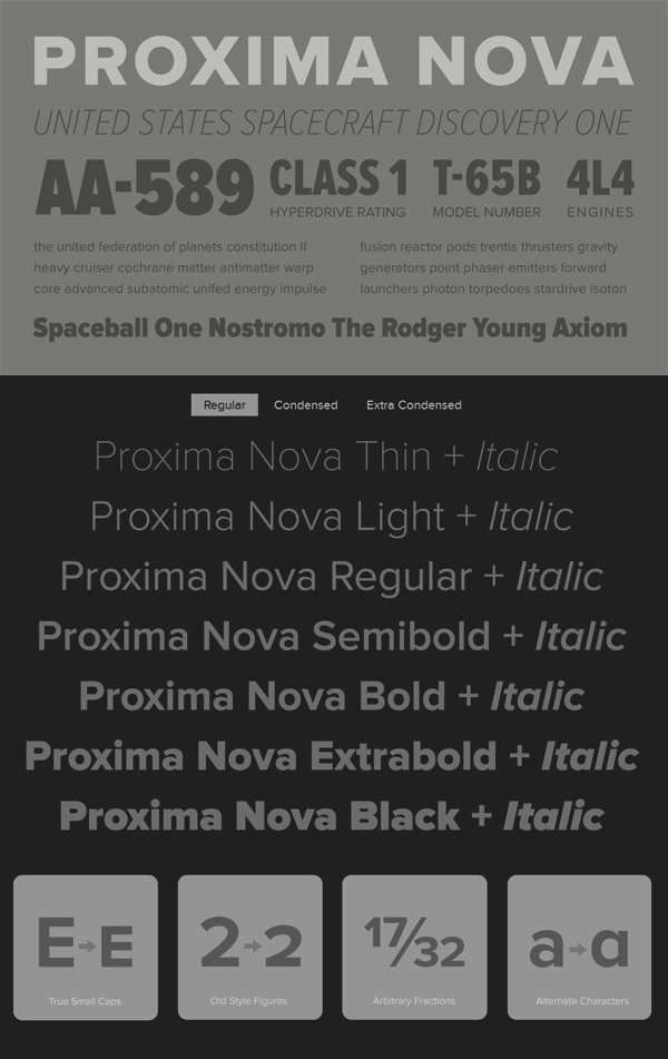
The Proxima Nova font family.
Famous typeface designer Mark Simonson has created the Proxima Nova font family as a gap between sans fonts like Futura and Akzidenz Grotesk. The result is a huge font family that provides contemporary proportions as well as geometric shapes.
Proxima Nova is a complete rework of the Proxima Sans typeface, created in 1994. Type designer Mark Simonson expanded the original 6 fonts into a huge sans serif font family consisting of 42 fonts including 7 weights in three widths (Regular, Condensed, Extra Condensed) plus matching italics. This versatile typeface works great for both headlines and long texts. Due to its good readability also on screen, Proxima Nova has become one of the most popular web fonts. An extended range of typographic features as well as multiple language support make Proxima Nova a font family for the highest demands, whether print or on screen.
This family does not require any trendy effects or unnecessary gimmicks. Its straightforward and geometric type design offers uncompromising clarity based on the beauty of simplicity. For more information about this remarkable sans type family, please visit the link below.
You can buy the complete Proxima Nova font family on MyFonts.com

The Proxima Nova font family is available for purchase on MyFonts.com
Check out more recommended fonts here.


