
This post contains affiliate links. We may earn a commission if you click on them and make a purchase. It’s at no extra cost to you and helps us run this site. Thanks for your support!
The Nomos Sans and Nomos Slab font families, designed by Moritz Kleinsorge and offered through his type foundry Identity Letters, epitomize a unique interpretation of the brutalist typeface genre. While the precise definition of a brutalist typeface remains open to interpretation, the Nomos superfamily unquestionably encapsulates the ethos of raw, direct, and honest design, akin to its architectural namesake.
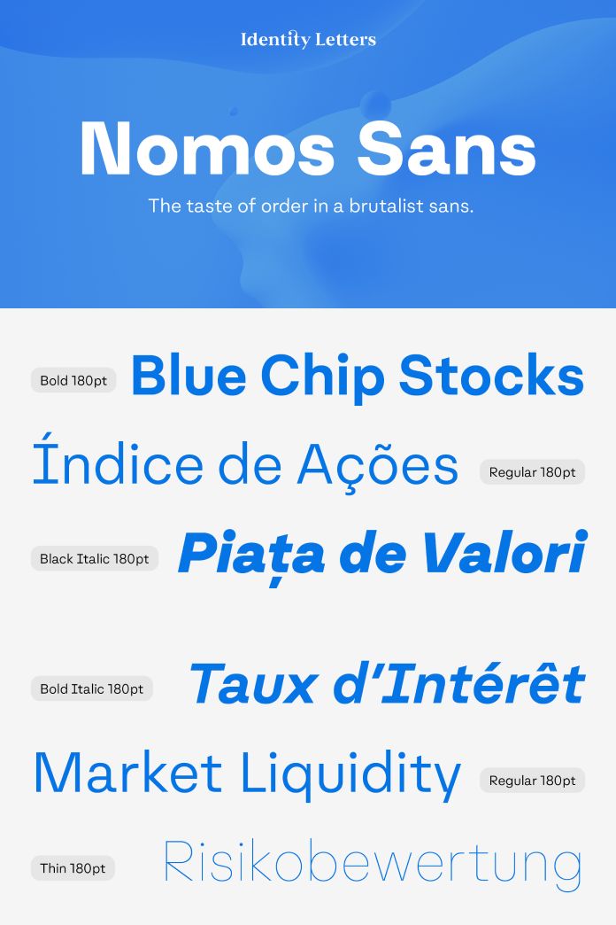
Nomos Sans, a low-contrast neogrotesk subfamily, showcases 18 distinctive styles and an expansive set of 1000+ characters. This typeface exudes confidence, making it an excellent choice for a wide range of applications, including fashion, finance, apps, and advertising. Its versatility is highlighted by its ability to be unassuming and efficient in body text, yet bold and vigorous in display sizes. The functional letterforms and the merging of diagonal and vertical stems reveal an orderly construction deeply rooted in classic modernism while embracing the contemporary demands of the Internet age. Nomos Sans truly shines when paired with Nomos Slab, exhibiting a seamless balance of poise and utility.
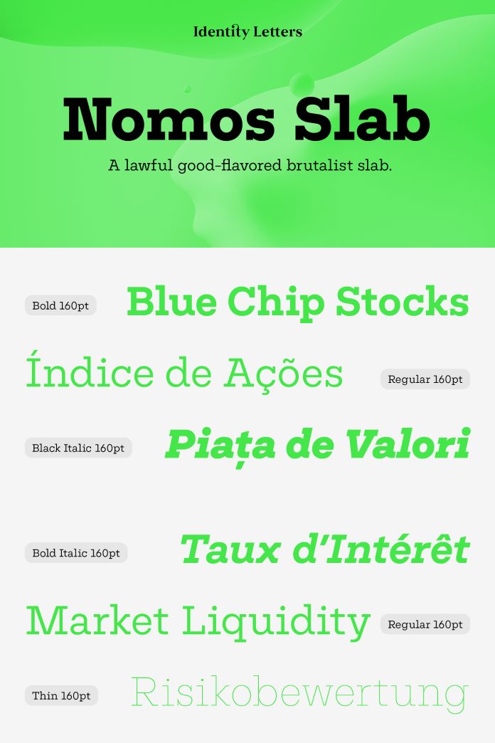
On the other hand, Nomos Slab, a low-contrast subfamily with 18 styles and an extensive character set, showcases tense curves that position it perfectly for modern applications like UI/UX design, AR/VR apps, and multimedia branding across various industries, from banking to beverages. The typeface’s tension-filled curves create a visually captivating appeal that aligns with contemporary design sensibilities, making it a compelling choice for projects seeking a blend of sophistication and innovation. Its compatibility and graceful pairing with Nomos Sans further emphasize its versatility and ability to complement a range of design contexts.
In summary, the Nomos superfamily by Moritz Kleinsorge through Identity Letters is a striking manifestation of the brutalist typeface genre. It adheres to the core principles of brutalism—rawness, directness, and honesty—embodied in an orderly construction rooted in both classic modernism and the digital age. Nomos Sans and Nomos Slab, when used individually or in harmony, offer designers a distinctive typographic toolkit that resonates with various design applications, showcasing the designers’ thoughtful curation and skillful execution.
Feel free to find more recommended typefaces in the Fonts section on WE AND THE COLOR.

Subscribe to our newsletter!


