
This post contains affiliate links. We may earn a commission if you click on them and make a purchase. It’s at no extra cost to you and helps us run this site. Thanks for your support!
What Makes the FOUN Font a Modern Design Powerhouse and a Typeface That’s Simply Fun to Use?
The FOUN font, a compelling design from the Fortunes Co. foundry, expertly proves this point. It merges clean, geometric forms with a distinct retro-futuristic vibe. This creates a visual language that feels both nostalgic and forward-thinking. This unique combination makes the FOUN font incredibly relevant for today’s design landscape. Brands constantly strive for both authenticity and innovation. Its condensed structure is not just a stylistic choice. It is a functional one, allowing for impactful statements in tight spaces. For designers seeking a font that delivers style without sacrificing substance, FOUN presents a compelling solution.
You can download the typeface for a very low budget from these sites:
Why Does This Retro-Futuristic Font Feel So Right, Right Now?
We live in a visual culture that constantly references the past while rocketing toward the future. The FOUN font sits perfectly at this intersection. Its design captures the bold, athletic spirit of vintage typography. It also incorporates the sharp, minimalist precision of futuristic aesthetics. This duality is its greatest strength. Consequently, it allows the font to feel familiar and trustworthy, yet exciting and new. Designers can therefore use the FOUN font to create work that connects with audiences on an emotional level. It taps into a shared sense of nostalgia while signaling a modern, progressive outlook. It’s a tool for building timeless coolness and confidence into any project.
You can download the typeface for a very low budget from these sites:
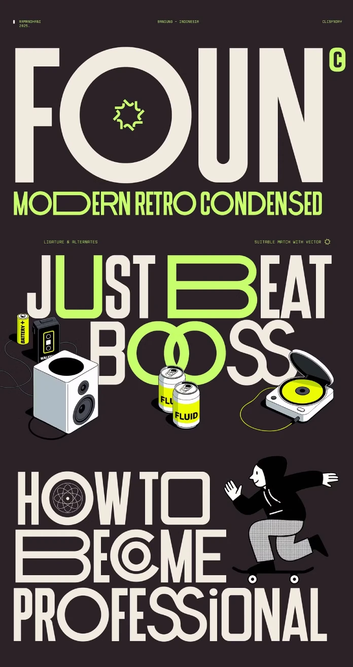
The Anatomy of the FOUN Font: A Closer Look
To truly appreciate the FOUN font, one must examine its core components. The design is built on a foundation of geometric precision. This gives it an immediate sense of order and clarity.

Key Structural Elements:
- Condensed Proportions: The tall, narrow letterforms are perfect for creating bold headlines. They work well for titles that demand attention. This makes the font highly effective for editorial layouts, posters, and digital campaigns.
- Oversized Lettering Feel: Despite its condensed nature, FOUN gives the impression of oversized letters. This adds to its confident and athletic personality, making a strong visual statement.
- Sharp Geometric Details: Clean lines and sharp angles define the typeface. These details contribute to its modern and urban feel, which is perfect for contemporary brands.
- Balanced Strokes: A striking balance between light and heavy strokes adds a dynamic rhythm. This enhances both readability and visual impact, making text pop off the page.
A Versatile and Complete Character Set
Beyond its striking appearance, the FOUN font is a practical tool for designers. Fortunes Co. has equipped it with a robust set of features. This allows it to handle a wide range of projects. The full character set includes both uppercase and lowercase letters. This ensures flexibility for headlines and supporting text alike.
Furthermore, the inclusion of ligatures allows for more sophisticated typography. These special characters combine two or more letters into a single, elegant glyph. The font also provides comprehensive support for simple Latin multilanguage characters. This makes it accessible for international projects. Of course, standard numbering and punctuation are included. This completes a toolkit that is as functional as it is stylish.
Strategic Applications: Where the FOUN Font Excels
The true measure of a font is its performance in real-world applications. The FOUN font is engineered for impact. This makes it an ideal choice for projects that need to be bold, stylish, and eye-catching.
Sports Branding and Urban Campaigns
The athletic and energetic feel of the FOUN font makes it a natural fit for sports branding. Think about team logos, apparel design, and promotional materials. Its sharp, geometric structure conveys power and precision. These qualities perfectly mirror athletic performance. Similarly, for urban-themed digital campaigns or fashion labels, FOUN provides an edgy, contemporary voice. It speaks directly to a modern audience that values authenticity and style.
Editorial Titles and Music Posters
In the world of publishing and music, grabbing attention is critical. The condensed and impactful nature of the FOUN font is perfect for magazine headlines. It also excels as a choice for titles on music posters. Its retro twist can evoke the feel of classic album art or vintage publications. Meanwhile, its futuristic elements keep the design fresh and relevant. This allows designers to create visually inspiring work that stands out in a crowded marketplace.
A Design Critic’s Perspective on FOUN
From a critical standpoint, the FOUN font is a thoughtful and well-executed typeface. It successfully avoids the pitfalls of many trendy fonts. Such fonts are often stylish but lack versatility. Its strength lies in its balanced design. The retro elements are not overly sentimental. The futuristic touches are not cold or sterile. Instead, Fortunes Co. has found a sweet spot. This spot feels both energetic and sophisticated.
You can download the typeface for a very low budget from these sites:
My personal opinion is that the FOUN font has the potential to become a modern classic. It responds directly to the current design zeitgeist. This spirit values authenticity, boldness, and a clever nod to the past. It’s a workhorse font disguised as a showstopper. The clean geometry makes it highly legible. Its unique character ensures it will be remembered. It provokes thought and invites designers to be bold in their creative choices. Any designer looking for a font with a strong personality should consider adding the FOUN font to their collection.
Check out other amazing typefaces here at WE AND THE COLOR, or take a look at our handpicked selection of 100 cool fonts for designers in 2026.
Subscribe to our newsletter!


