This post contains affiliate links. We may earn a commission if you click on them and make a purchase. It’s at no extra cost to you and helps us run this site. Thanks for your support!
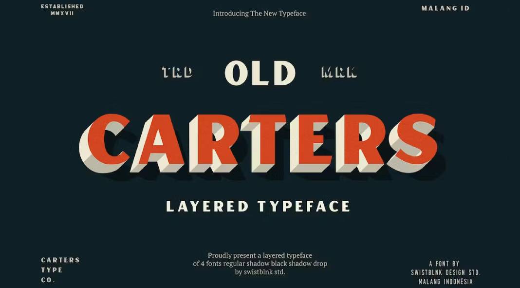
Unveiling the timeless charm of the Carter typeface with several layering options.
If fonts were a time machine, Carter would undoubtedly be the DeLorean of the typographic realm. This layered typeface is not merely a collection of characters; it’s a journey through the vintage lanes of retro signage, a nostalgic stroll down the memory lane of classic design. Carter is not just a font; it’s an experience, a trip back to an era where every sign told a story, and every letter had character.
The Layered Symphony: Carter’s pièce de résistance lies in its layered system, a symphony of typographic elements that allows you to orchestrate a visual masterpiece. The collection reads like a love letter to the bygone era of signboards and neon lights, offering a palette of options to evoke the spirit of retro charm in your projects.
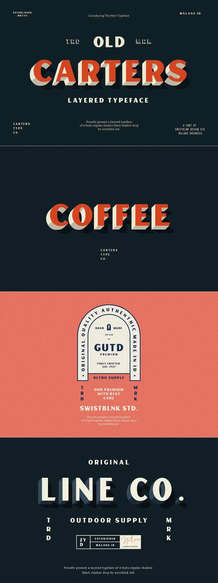
The Palette:
Carters Regular lays the foundation, a solid base for your typographic adventure. Then comes Carter Shadow, adding depth and dimension like shadows dancing in the golden glow of a vintage street lamp. Elevating the experience, Carter Black Shadow introduces a touch of noir, a nod to the mystery of old detective novels.
But the real showstopper is Carter Drop, a cascade of nostalgia that drips down like raindrops on a foggy window. And finally, the pièce de résistance – the Layered Features. Uppercase, lowercase, numerals, and punctuations play together harmoniously, offering an endless array of combinations. It’s not just a font; it’s a design playground where creativity knows no bounds.
Versatility Unleashed:
Carter is not confined to the pages of history; it’s a contemporary tool for the modern creative. Suitable for headlines that demand attention, logotypes that narrate a brand’s story, signs that guide the way, posters that shout from the walls, letterheads that speak professionalism, and T-shirts that wear memories – Carter is a versatile companion in the designer’s toolkit.
Conclusion:
In a world where every font competes for attention, Carter doesn’t scream; it whispers in the elegant cadence of a bygone era. It’s not just a typeface; it’s a vessel that carries the essence of nostalgia into the contemporary design landscape. So, buckle up and let Carter take you on a typographic joyride through the annals of design history – where the past meets the present, and every letter tells a story.
Don’t hesitate to browse through the Fonts section on WE AND THE COLOR for more reviews of exceptional typefaces.
Subscribe to our newsletter!

