
This post contains affiliate links. We may earn a commission if you click on them and make a purchase. It’s at no extra cost to you and helps us run this site. Thanks for your support!
Design influences emotions, sets moods, and builds identities. As 2026 approaches, the creative community is buzzing about which hues and letterforms will shape the visual landscape. Color trends hint at a shift toward warmth, authenticity, and comfort. Typography is evolving to become more expressive and responsive. Why are designers gravitating toward these palettes? How will fonts reflect cultural change? What can you learn from these trends to elevate your own work?
This forecast draws together expert insights, trend analyses, and emerging patterns to identify the color palettes 2026 and typography trends 2026 that will define the new year. It explores the cultural context behind these developments and offers practical advice for applying them.
The cultural context of design in 2026
Major design shifts don’t happen in a vacuum. They are shaped by social mood, economic realities, and technological innovation. Warm neutrals and earthy tones signal a desire for stability and connection in uncertain times. Consumers are moving away from fleeting micro-trends and embracing personal expression. Research shows that typography influences how people perceive brands, which means type choices matter more than ever. Comfort, nostalgia, and authenticity are central themes in the design forecast 2026, guiding both color and typography trends.
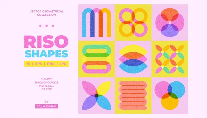
Color palettes 2026: from khaki to deep plum
Warm neutrals & reddish browns
Expect a departure from cool grays toward warmer neutrals. Midtone tans with subtle yellow undertones serve as versatile backdrops that feel grounded yet contemporary. Earthy browns are also surging in popularity. Shades reminiscent of chestnut, mahogany, and cola combine sophistication with comfort. Rich brown stains and paints that evoke natural wood tones work well in both residential interiors and brand identities.

Nature-inspired yellows & greens
The sun still shines in 2026, but in softer, more relaxed shades. Think parchment, flax, and buttermilk—gentle yellows inspired by stone architecture and natural landscapes. These tones pair beautifully with warm neutrals and can serve as uplifting accents. Greens remain a favorite, evolving into smoky jades, grounded eucalyptus, and rich citrons. These greens bridge the gap between nature and modernity and can be used as new neutrals.

Surprising purples & sultry reds
Purples will no longer be sidelined. Expect deep plums, amethysts, lilacs, and pale mauves. Violet hues offer an unexpected alternative to blue while maintaining a calming quality. Deep reds—carmine, crimson, and burgundy—will also have a moment. These sultry shades carry earthy undertones and make dramatic statements when used thoughtfully. Warm reds pair well with natural textures and metals, bringing depth to interiors and branding.
Pink-leaning neutrals & icy pastels
Warm neutrals with pink undertones soften minimalistic color schemes. Muted blushes, soft peach beiges, and clay-inspired hues exude warmth while remaining versatile. Meanwhile, icy pastels introduce refreshing alternatives to white. Silvery greens, whispering blues, and muted lavenders add subtle interest without overwhelming other elements. Overall, there is a move toward lower saturation and calmer palettes.
A snapshot of standout colors
- Universal Khaki: A midtone tan offering clean simplicity.
- Hidden Gem: Smoky jade that shifts between blue and green.
- Warm Eucalyptus: Grounded green with warm undertones.
- Warm Mahogany: Rich red-based brown inspired by wood.
- Adventurer: Regal plum aubergine with a jewel-tone edge.
- Divine Damson: Deep plum with hints of dark cherry.
- Melodious Ivory: Creamy beige for timeless comfort.
- Matte Coffee Bean: Earthy brown celebrating craftsmanship.
- Special Walnut: Warm brown stain highlighting natural wood.
- Epernay: Soft ochre evoking French limestone architecture.
These selections reveal a preference for hues that balance comfort with individuality.
Typography trends 2026: expressive type & adaptive lettering
Large, impactful fonts & variable type
Typography in 2026 favors bold, attention-grabbing letters. Oversized fonts ensure that messages are seen quickly and clearly, especially in social media and advertising. Variable fonts—families that allow designers to adjust weight, width, and contrast within a single file—will continue to gain traction. Such flexibility allows the type to adapt seamlessly across screens, print, and motion graphics.
Dynamic & AI-assisted typefaces
Type is becoming responsive and intelligent. Designers are using dynamic typefaces that adjust based on user interaction or context. AI tools can now suggest font pairings or even generate custom lettering. With technology co-creating letterforms, typography becomes less static, enabling experimentation and personalization while still maintaining readability.
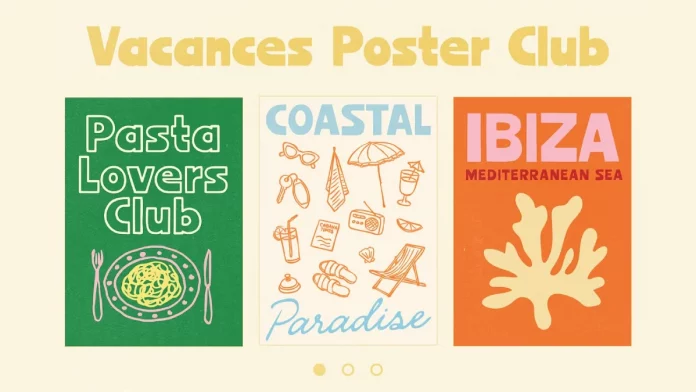
Retro revival & typographic innovation
Nostalgia remains strong. Many designers are revisiting 70s and 80s aesthetics—serif fonts, punk-inspired lettering, and gothic forms—then remixing them for modern platforms. Bold serif fonts paired with muted jewel tones evoke a sense of heritage while feeling current. Using retro icons or stamp-style motifs can strengthen brand storytelling and evoke nostalgia.
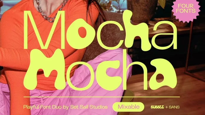
You can purchase the duo from these sites:
Geometric simplicity & altered letterforms
Minimalism continues, but with playful twists. Geometric cropping and letter distortion are trending. Words may be framed in hexagons, half-circles, or other custom shapes. Letterforms may overlap, curve, or cut out sections to create unexpected effects. These techniques keep designs sleek while adding personality.
Neo-brutalist elegance & anti-design
Expect to see raw, stripped-back design infused with sophistication. Neo-brutalism combines monochrome palettes, exposed grid systems, and stark typography. It’s especially popular in the tech and fintech industries. Conversely, anti-design embraces disorder: broken grids, clashing colors, and chaotic compositions. Both approaches emphasize authenticity and challenge conventional beauty.
Kinetic typography & motion identity
Words are moving. Kinetic typography—text that animates—will be central in 2026. Scroll-activated effects, animated overlays, and dynamic headers appear across social media, video, and apps. These subtle motions attract attention, enhancing user engagement. When used sparingly and thoughtfully, moving text can make messages memorable without overwhelming the viewer.
Sustainability & social impact through type
Designers increasingly use typography to signal values like sustainability. Choosing simple line weights, organic textures, and eco-friendly materials reflects a commitment to environmental responsibility. Fonts with handmade or imperfect qualities convey sincerity. Consistency in typography also supports social causes, connecting visual identity with brand ethos.
Practical advice for designers
- Balance warmth and contrast. Use warm neutrals as your base and layer in greens, yellows, and reds to create depth. Pair calm backgrounds with bold accents to maintain interest.
- Embrace expressive fonts. Experiment with oversized headings, variable fonts for flexibility, and dynamic typefaces that react to user interaction.
- Combine retro and modern. Mix classic serifs with clean sans-serifs. Distort letterforms or crop text for contemporary twists.
- Animate wisely. Adopt kinetic typography to highlight key messages. Keep movement smooth and purposeful to avoid distraction.
- Use color thoughtfully in type. Let pastel or earthy tones calm the viewer and save saturated hues for calls to action.
- Communicate values. Opt for eco-friendly materials and simplified, handcrafted fonts to show authenticity.
- Stay adaptable. Use these trends as inspiration rather than rules. Adapt your palette and typography to suit each project’s audience and message.
The design forecast for 2026 reveals a world that values warmth, authenticity, and innovation. Color palettes lean toward midtone tans, earthy browns, softened yellows, smoky greens, deep plums, and sultry reds. Typography, meanwhile, becomes larger, more flexible, more responsive, and more expressive. While nostalgia influences many trends, modern tools like AI and kinetic animation push type into new territory. Sustainability and personal storytelling guide both color and type decisions.
Designers who understand these trends can create work that feels current and meaningful. By balancing comfort with experimentation and combining timeless elements with new technologies, you can produce designs that resonate with audiences and stand out in a crowded visual landscape.
Feel free to browse WE AND THE COLOR’s Graphic Design and Fonts categories for more inspiration.
Subscribe to our newsletter!


