
This post contains affiliate links. We may earn a commission if you click on them and make a purchase. It’s at no extra cost to you and helps us run this site. Thanks for your support!
Novera, a modern and geometric sans-serif font family created by German typeface designer René Bieder.
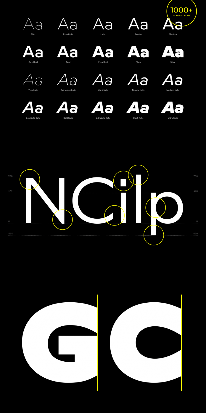
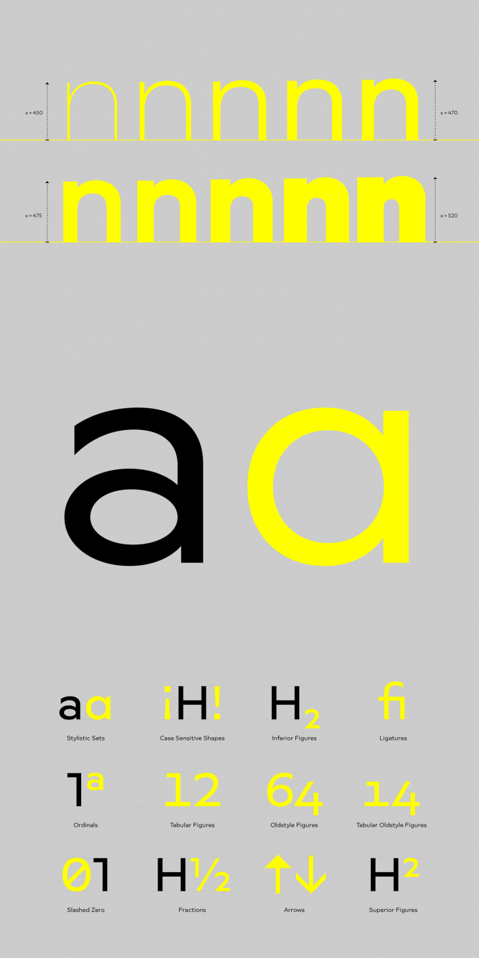
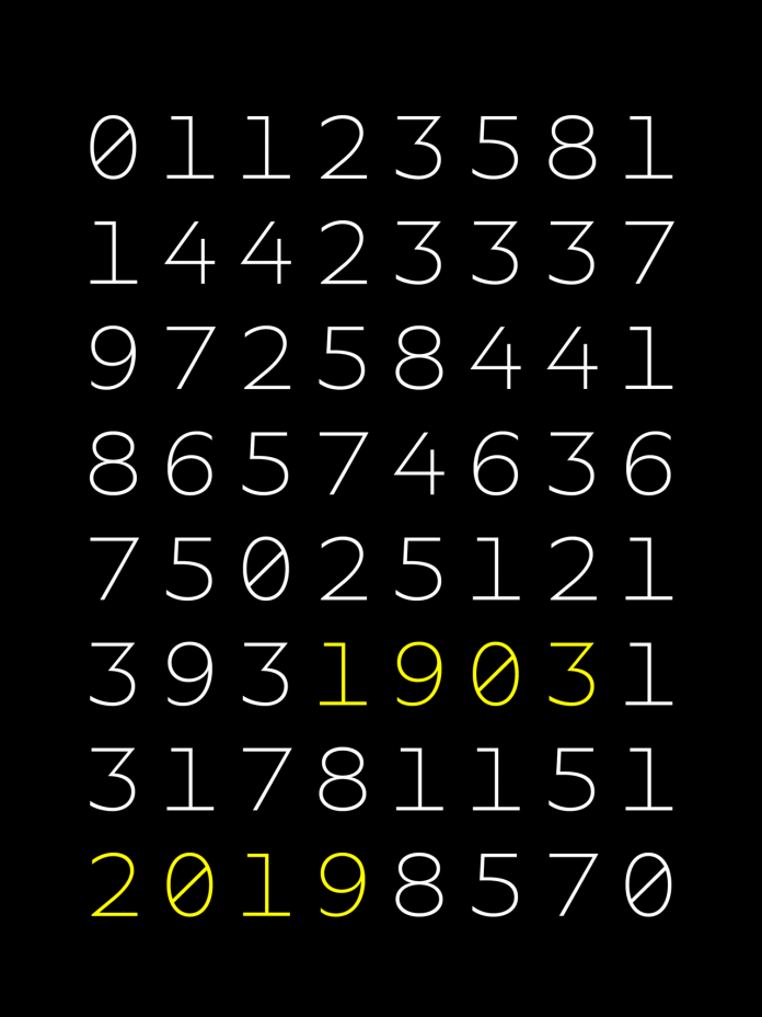
Designed and published just recently by German typeface designer René Bieder, the Novera font family is based on a sharp geometric sans-serif typeface. It is available in 10 weights as well as 2 versions plus matching Italics for each weight. Its multifunctional yet characteristic design comes with an extensive set of over 1000 glyphs per font.
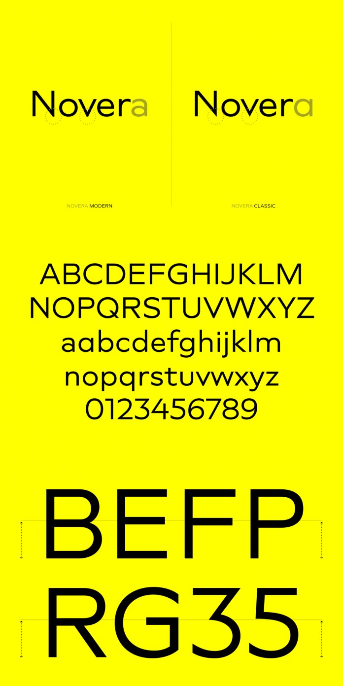
Novera’s typeface is based on vertical terminals, circular shapes, and angular apexes. The idea was to create a highly-legible font family, which is suitable for everyday usage inspired by the work of Paul Renner, Eric Gill or Jakob Erbar. Novera combines the geometric look with a human touch, functionality, and unconventional alternates.
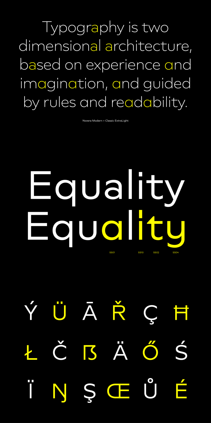
To maintain Novera’s distinctive neutrality and modern appearance, its basic character set largely dispenses with idiosyncratic forms. This design concept is in contrast to the alternate letterforms with the Gill-like lowercases such as ‘g’ and ‘t’ as well as a traditional shape of the letter ‘S’ and the German ligature t/z, which dates back to old German spellings. Also inspired by German poster designs from the early 20th century are the elongated i-dots and dieresis-dots that work well in headlines or logos.
Feel free to discover more typefaces in our recommended Fonts category.
Subscribe to our newsletter!


