
This post contains affiliate links. We may earn a commission if you click on them and make a purchase. It’s at no extra cost to you and helps us run this site. Thanks for your support!
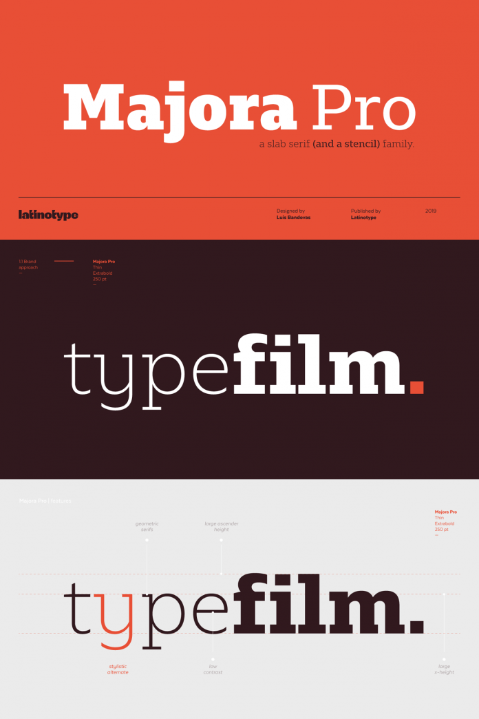
Majora Pro, a slab serif font family that is characterized by humanistic features and a moderate contrast between thick and thin strokes.
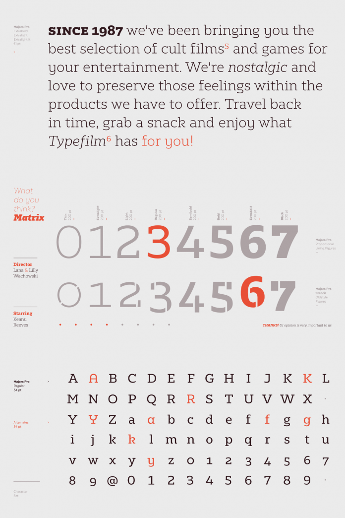
Designed by Luis Bandovas in 2019 for foundry Latinotype, the Majora Pro font family consists of 8 styles ranging from a subtle thin to a massive black weight plus matching Italics as well as an upright version of stencil fonts.
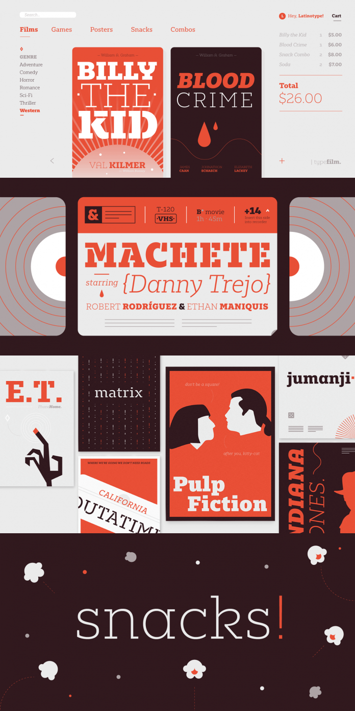
This slab serif font family is an ideal choice for a wide range of applications including packaging and editorial design as well as any kind of screen design, just to name a few. Majora Pro’s look is characterized by humanistic features and a moderate contrast between thick and thin strokes. You can use it for both, eye-catching headlines and long text sections in any size. The set of alternate glyphs is great to give your typographic compositions a different and unique touch. Majora’s additional Stencil version was specially made for use in applications such as signage, packaging, and striking titles. The extensive character set contains 750 glyphs including small caps, different figure styles, and so much more. Majora Pro supports more than 200 Latin-based languages. To learn more, just click on the following link or have a look at the following images.
Feel free to browse through our extensive Fonts category to find other professional typefaces for different needs.


