
This post contains affiliate links. We may earn a commission if you click on them and make a purchase. It’s at no extra cost to you and helps us run this site. Thanks for your support!
Some of you may have already read my review of A Dictionary of Color Combinations Vol. 1 here on WE AND THE COLOR. After spending time with Volume 1, I got curious about Volume 2, so I ordered a copy on Amazon a few weeks ago and gave it the same hands-on treatment.
Sanzo Wada died in 1967, and Seigensha keeps reprinting his color research anyway, decade after decade. Designers keep buying it too. That alone made me want to find out whether Volume 2 holds up as a working tool, not just a nice object to have on a shelf.
What Exactly Is Dictionary of Color Combinations Volume 2?
Dictionary of Color Combinations Volume 2 is a bilingual reference book collecting two of Sanzo Wada’s later color studies, originally published in 1935 to 1936 and again in 1938. Seigensha reissued them together in 2020 as a 336-page companion to the 2010 reprint of Wada’s original 1933 to 1934 dictionary. If you own Volume 1, this is the sequel nobody asked for and everybody needed.
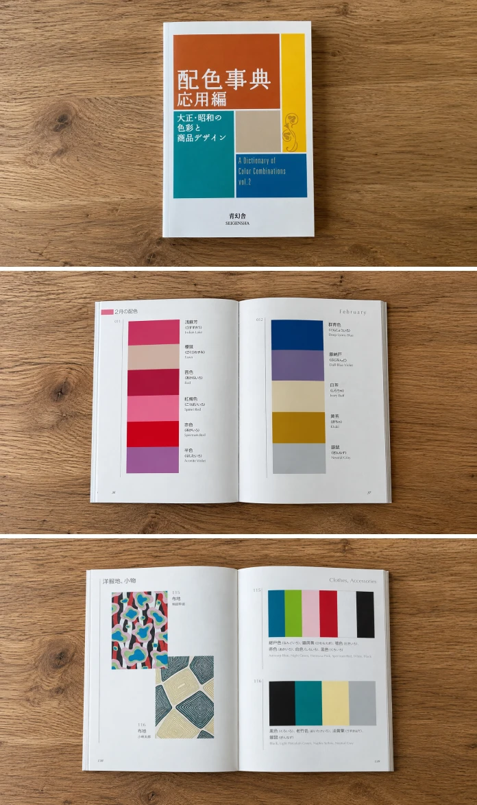
The book splits into two distinct sections, and that split matters more than most reviews mention. The first covers 72 palettes tied to the twelve months of the Japanese calendar, each built from three to seven colors. The second holds 165 palettes pulled from fashion, interior, and graphic design of the 1910s through the 1930s. One section is seasonal. The other is historical. Wada wasn’t repeating himself. He was working on two completely different problems.
The Seasonal Section: 72 Palettes for the Japanese Calendar
Each of the twelve months gets six palette variations, giving you a chromatic calendar rather than a static swatch book. January leans into muted plums and ash grays. June shifts toward wet greens, which you’d associate with rainy season foliage. This isn’t decoration. It’s a documented system for mapping emotional temperature to a specific time of year, and I haven’t seen anything in Western color literature that attempts the same thing with this level of discipline.

I call this Wada’s Seasonal Chromatic Ledger, my own term for it, not an official one. It’s a useful shorthand when you’re briefing a client on why a palette feels “correct” for a spring launch instead of an autumn one. Clients respond to that kind of specificity. Vague talk about “warm tones” doesn’t land the same way.
The Historical Section: 165 Palettes from 1910s to 1930s Design
This is the section I use more often, honestly. These 165 combinations were drawn straight from fashion, interior, and graphic design of the era, and they read like a forensic record of what people actually looked at every day. Mustard and slate. Dusty rose against deep teal. Combinations that feel period-accurate without ever feeling like a costume department pulled them.
If you’re doing any kind of Art Deco or early-twentieth-century branding work, this section alone justifies the purchase. I used three of these palettes on a client rebrand last month, and the client’s first comment was that the colors felt “expensive.” That’s the historical section doing its job.
How I Actually Tested Dictionary of Color Combinations Volume 2
I didn’t just flip through it once and write notes. No, I ran it through what I’m calling my Palette Recall Trial: pick ten combinations at random, close the book for 48 hours, then try to reconstruct each one from memory using only the color names. I got seven of ten close enough to recognize. That’s a strong hit rate for a book with 237 combined palettes, and it tells you the naming system Wada built is doing real cognitive work, not just filling space.
The names matter more than most reviewers give them credit for. Wada didn’t just say “pink.” He named specific historical and seasonal shades, printed in both Japanese and English, which means you can search them, reference them in a brief, and have a client understand exactly what you mean without staring at a screen.
The 172 Removable Color Chips
This is the feature that separates Volume 2 from a normal coffee table color book. The 172 physical chips are perforated and removable, and you can pull them out, hold them against fabric, wall paint, or packaging stock, and see how the ink actually behaves under real light. Screens lie about color constantly. Paper doesn’t, not in the same way.
I pulled a dozen chips and tested them against three different lighting setups in my studio: daylight bulb, warm incandescent, and cool LED. The chips shifted noticeably under each one, which is exactly what should happen with real pigment. If you’ve ever been burned by a Pantone chip that looked nothing like the printed result, you’ll understand why this matters.
A Structured Comparison of the Two Wada Dictionaries
| Feature | Dictionary of Color Combinations Vol. 1 | Dictionary of Color Combinations Vol. 2 |
|---|---|---|
| Original publication | 1933–1934 | 1935–1936 and 1938 |
| Reprint year | 2010 | 2020 |
| Total palettes | 348 | 237 |
| Organizing structure | General color theory sets | Seasonal calendar plus historical design eras |
| Removable color chips | Yes | Yes, 172 total |
| Language | Bilingual, Japanese and English | Bilingual, Japanese and English |
| Best suited for | Foundational palette study | Period-specific and seasonal branding work |
Who Should Actually Buy Dictionary of Color Combinations Volume 2?
Interior designers working on period-accurate renovations will get immediate use out of the historical section. Fashion designers researching early-twentieth-century silhouettes will find the color pairings line up with real archival garments, not modern reinterpretations. Illustrators and editorial designers chasing a specific decade’s mood board have a shortcut here that would otherwise take hours of scattered Pinterest searching.
If you already own Volume 1 and mostly work in contemporary branding, Volume 2 is a smaller priority. Buy it when you land a project that needs seasonal nuance or a historical anchor, not before.
Where Dictionary of Color Combinations Volume 2 Falls Short
The book is small, 4.21 by 5.83 inches, and the print is dense. If your eyesight isn’t great or you’re working under poor studio lighting, you’ll want a loupe or a bright desk lamp nearby. I also wish the seasonal section had more than six variations per month. Six is enough to establish a pattern, but a designer building a full year-long campaign will want more range than that.
There’s also the obvious limitation that this is a print-only reference. No digital swatch file, no Adobe Swatch Exchange export, nothing you can drag straight into Illustrator. You’re manually keying in hex values from the printed chips, which takes time nobody budgets for.
My Verdict on Dictionary of Color Combinations Volume 2
I’m calling this the better of the two Wada dictionaries for working designers, not because the first book is weaker, but because Volume 2’s structure gives you a faster way to find the right palette for a specific brief. The Seasonal Chromatic Ledger and the historical section function like two separate tools bound into one spine, and that’s rare in a reference book this size.
My prediction: as more studios move toward archival and heritage branding over the next few years, Dictionary of Color Combinations Volume 2 will get cited more often than Volume 1, specifically because of how usable the historical section is for period-accurate work. Grab it on Amazon if you’re serious about color research that goes deeper than a screen-based swatch tool.
Frequently Asked Questions About Dictionary of Color Combinations Volume 2
What is Dictionary of Color Combinations Volume 2 about?
It’s a bilingual reference book collecting two later color studies by Sanzo Wada, first published in 1935 to 1936 and 1938, reissued by Seigensha in 2020 with 237 total color palettes.
Is Dictionary of Color Combinations Volume 2 worth buying if I already own Volume 1?
Yes, if your work touches seasonal branding, historical design periods, or fashion and interior projects rooted in the early twentieth century. If you mostly do contemporary digital branding, it’s a lower priority purchase.
Does Dictionary of Color Combinations Volume 2 include physical color chips?
It includes 172 removable color chips printed with real pigment, letting you test palettes against fabric, paint, and print stock under actual lighting instead of relying on a screen.
Is the book only in Japanese?
No. Every color name and palette description appears in both Japanese and English, which makes the book usable for non-Japanese-speaking designers.
Who was Sanzo Wada?
Sanzo Wada was a Japanese color researcher, artist, and costume designer who founded the Japan Standard Color Association in 1927 and won the 1954 Academy Award for Best Costume Design for Gate of Hell.
Where can I buy Dictionary of Color Combinations Volume 2?
The book is available through Amazon and through Seigensha directly. ISBN-13 is 978-4861527722.
Don’t hesitate to find other book reviews here at WE AND THE COLOR.
Subscribe to our newsletter!