YO! Sushi brand refresh by London based creative studio & SMITH.
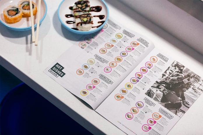
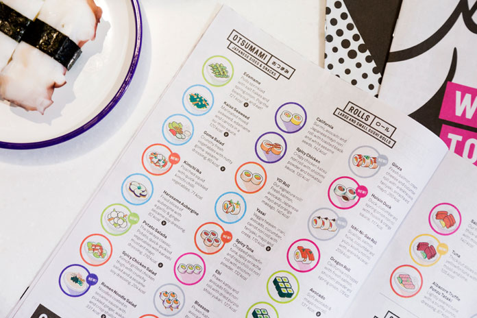
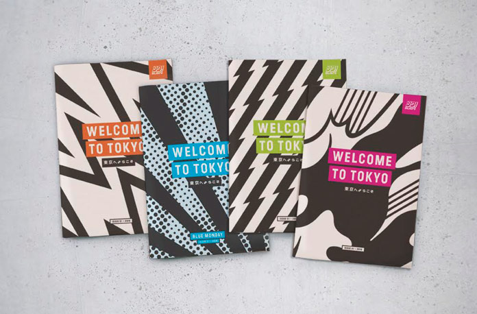
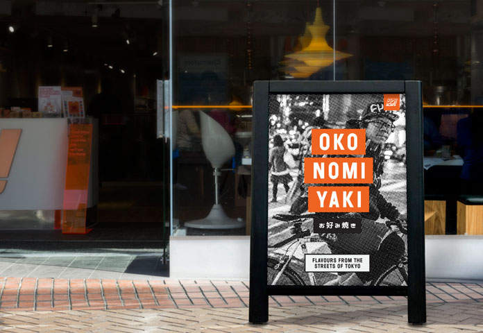
The creative team of London based studio & SMITH partnered with YO! Sushi to refine their brand strategy and refresh the existing look and feel. YO! Sushi is a place where people can experience a true taste of modern Tokyo. The brand idea and menu launch campaign centered around the theme of ‘This is Tokyo’ as a concept. All of YO’s tasty foods are inspired by Japanese classics, both street food and homemade dishes. Studio & SMITH’s design solution takes cues from Japanese anime and manga culture with the addition of a more modern, pop art inspired touch. They didn’t have to dumb anything down. The design team of & SMITH introduced Kanji script to menu and made sure all sections were named as they would be in Tokyo. The launch campaign leads with Japanese dish names so everyone can learn the difference between Takoyaki (octopus filled dough balls) and Okonomiyaki (street food pancakes). Read more below the first image.
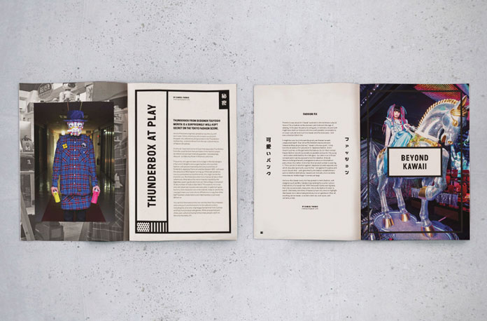
After an initial meeting with Mike Lewis (the executive chef), Dan Bernstein, director of & SMITH said: “He told me his tales of searching the streets, homes and restaurants of Tokyo hunting down the best recipes and ingredients to bring back to the UK. From then on it was obvious this was something we had to shout about.” They wanted to give everyone a taste of what’s going on in Tokyo right now. That’s where the zine/newspaper menu idea came from. It gives the chance to show some nice snippets of art, fashion and music alongside the food. The idea is that the editorial content will change four or five times a year.
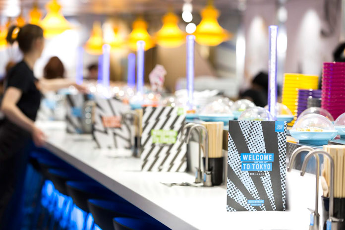
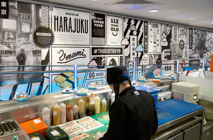
The new brand identity was rolled out across all 70+ sites in the UK over the last two weeks and is about to launch on all sites in the US later in the month. All illustrations were created by & SMITH. As well as new menus, & SMITH created the launch campaign, A-boards, menu boards, interior graphics and window wraps as a part of the refresh. There’s more to come over the next few months. For further information about the London based studio and their creative work, feel free and have a look at their website.
