WeWork – Physical Social Networking
Identity by Squat Design.


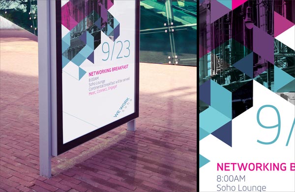
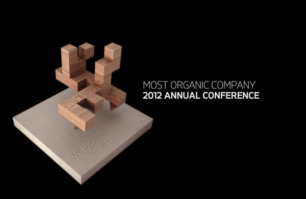
“WeWork is an office-suite business, with a distinct concept – it constructs space with open floor plans and glass partitioning to enhance tenant interaction, which builds a physical social network capability resulting in business activities between tenants. Its mission is to create environments that support creativity, collaboration and innovation. WeWork has grown to six buildings and nearly 2000 members.
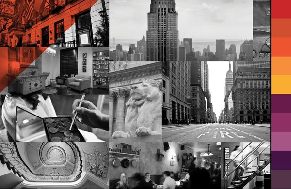
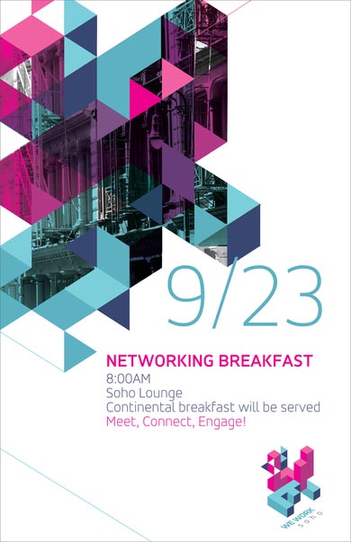
It was Squat Design’s challenge to create a brand system for all the buildings and the corporate entity that was not only consistent but also flexible enough to grow as WeWork continued to expand in new locations. Additionally, it must be international in scope for WeWork’s objective to grow internationally. And lastly, the flexibility must be able to expand cross-industry as the WeWork brand branches out.
One of Squat Design’s proposed solutions to this branding challenge was to develop a grid/color system to give each building a separate yet consistent identity. The brand system is edgy, energetic and cool, which reflects the attributes of the target market.”
More here.


