This post contains affiliate links. We may earn a commission if you click on them and make a purchase. It’s at no extra cost to you and helps us run this site. Thanks for your support!
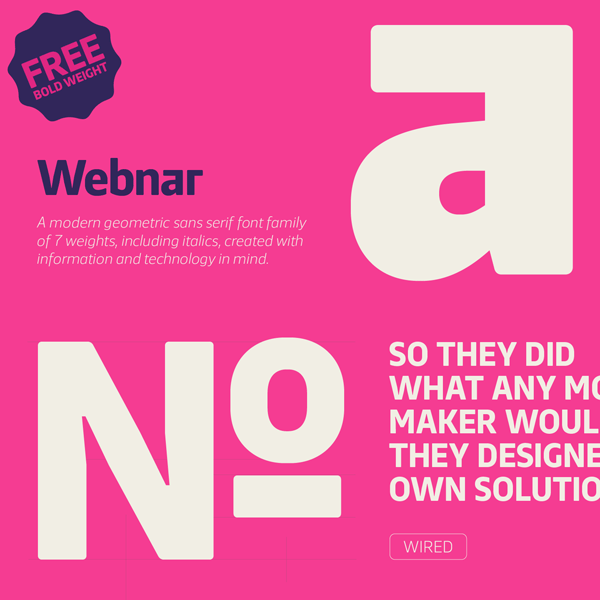
The Webnar font family, a modern sans serif typeface from The Northern Block Ltd.
Mariya V. Pigoulevskaya, a Great Britain based type designer of foundry The Northern Block Ltd has created the Webnar font family in 2015. It’s a modern, geometric sans serif intended for the use in informative design, technology, print and especially in app and web design.
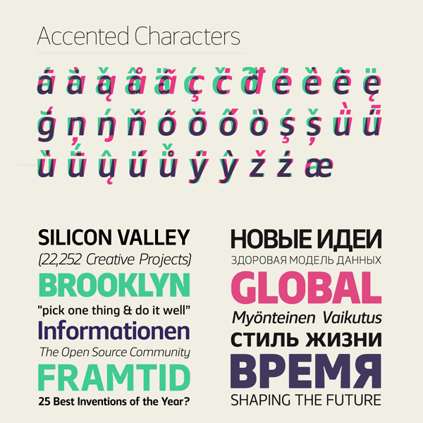
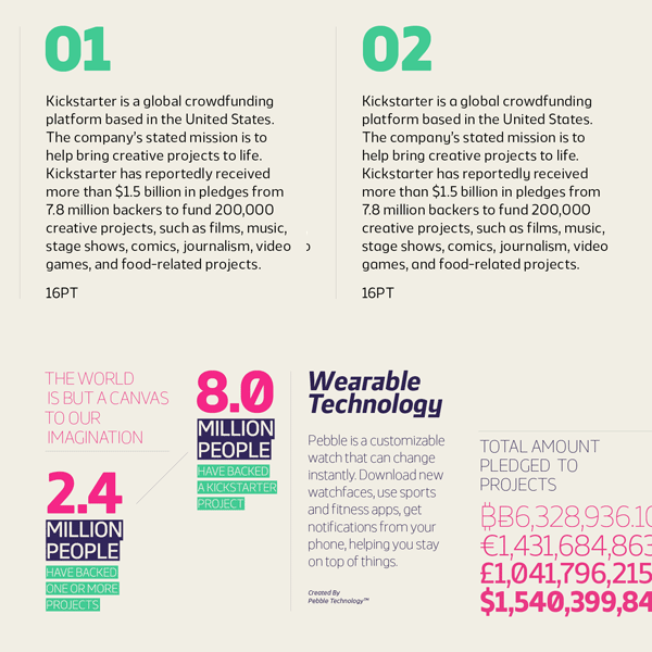
Webnar comprises 14 fonts including 7 weights of uprights plus matching italic versions. The diverse weights ranging from Thin to Black. This functional, versatile and highly legible sans serif font performs well in both print and on screen. The additional set of alternative characters also includes a set of geometrically constructed glyphs. They work great for striking headlines. The Webnar font family supports multiple languages also for Cyrillic letters and languages with accented characters.
You can buy this family on MyFonts.
This sans serif type family is available for purchase on MyFonts.com





The awkward angle/slant on the capital ‘M’, towards the vertex puts me off an otherwise nice looking typeface.