TĀTOU. agency identity system developed by 485 Design, an Auckland, New Zealand based studio.
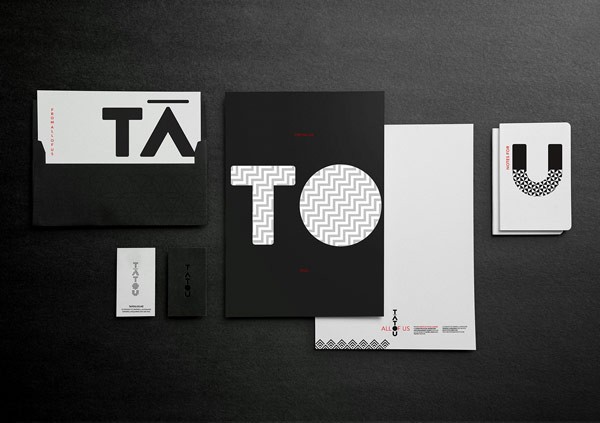
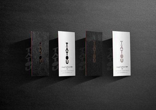
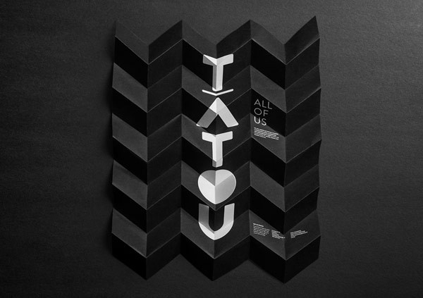
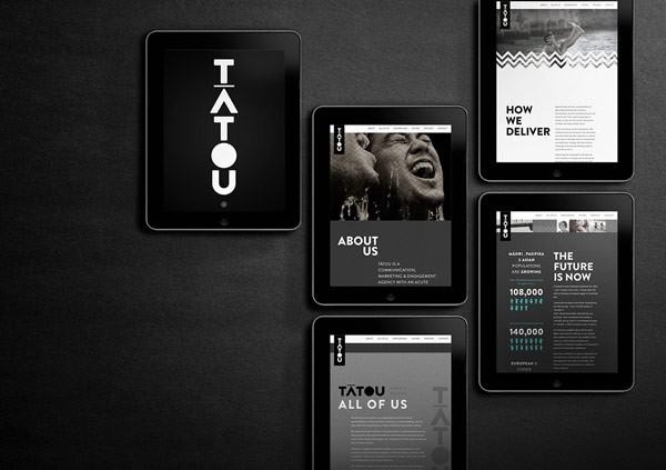
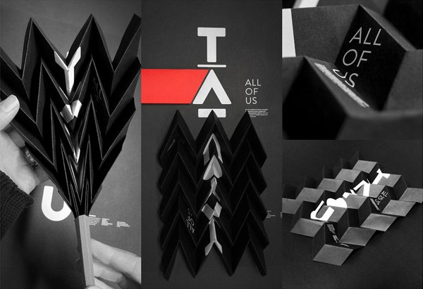
A team of Auckland, New Zealand based studio 485 Design was commissioned to develop an identity system for the new cultural communications agency, TĀTOU. The agency specializes in creating unique and effective communications. Their work is based on a more personal level, helping to effect social change.
Studio 485 Design developed a vertical logotype for the word “tatou”, which is Maori and means “all of us”. The visual identity system is based on a color scheme of black, white, and red (with a small nudge of pacific blue). The red is used sparingly to create emphasis. 485 Design also developed different patterns that are used as subtle textures. In addition, they link to the diverse cultures within Aotearoa (New Zealand).
Creative Director: Nathan Chambers
Senior Designer: Sam Cox
Photographer: Luke Harvey
Check out more graphic design and branding projects on WE AND THE COLOR.


