This post contains affiliate links. We may earn a commission if you click on them and make a purchase. It’s at no extra cost to you and helps us run this site. Thanks for your support!
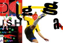
The Servus Slab font family by type designer Michał Jarociński of Dada Studio.
There is a lovely story behind this typeface. Type designer Michał Jarociński started working on the Servus Slab font family right after his first son was born. He decided to name this type family “Servus” which means “Hello”. Michał Jarociński says: “The whole idea of the family symbolizes a child’s growth.” Servus Slab starts with Thin and Narrow weights. Just like a newborn baby, the font family slowly grows to Black and Wide. And just like the care of his child, Michał Jarociński put all his love into the design of the Servus Slab typeface.
The font family is equipped with 9 weights plus matching italics. The included light and bold versions provide a strong personality, which works great for headlines and all kinds of display uses. At the same time, the more regular weights offer a well-balanced thickness resulting in good legibility also in long and small texts. The character set supports all common latin languages. Servus Slab also includes some fine OpenType features such as numerals, small capitals, fractions, and ligatures.
You can buy the entire family on MyFonts.
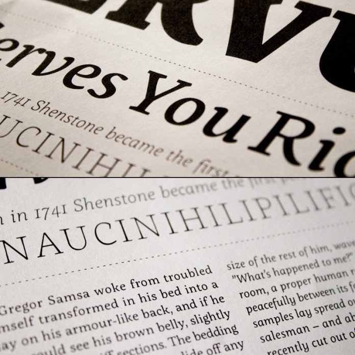
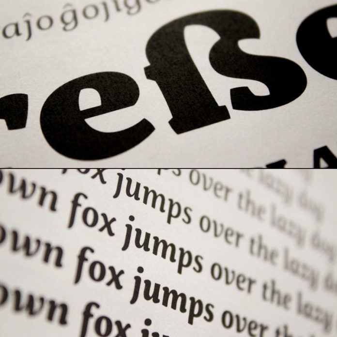
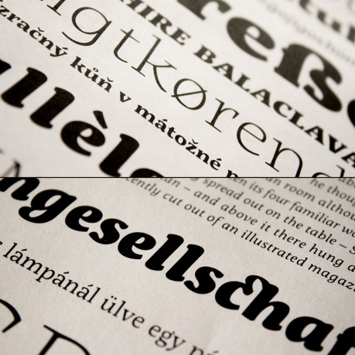
The Servus Slab font family is available for purchase on MyFonts.com
Check out more recommended fonts here.





anyone thinks about cyrillic?
There are also some fonts in our recommendations, which support cyrillic letters. Please check out this link: http://weandthecolor.com/tag/cyrillic
Thank you. But you’re so funny: I want this one and you offer me anothers