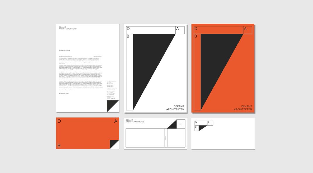
A corporate identity based on a powerful color range and geometric forms.
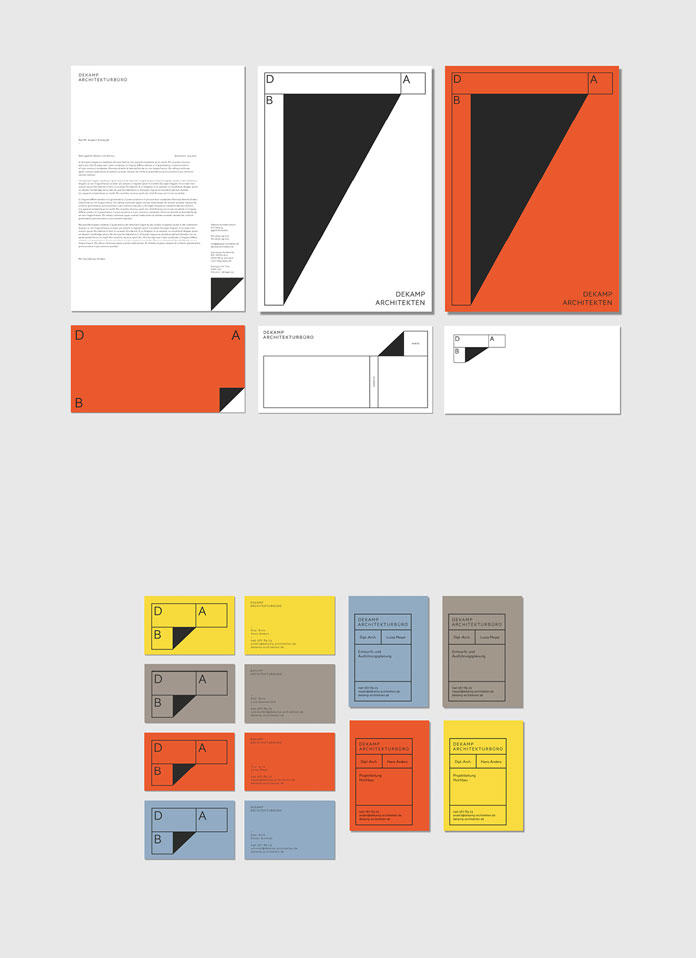
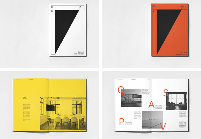
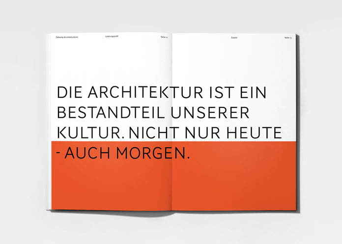
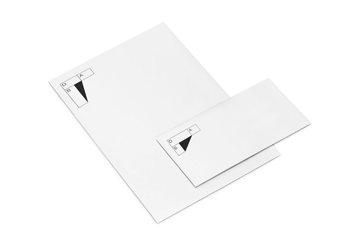
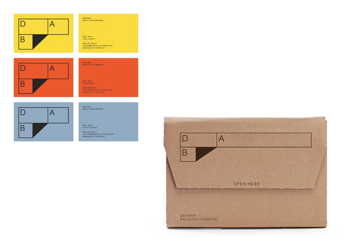
The Frankfurt, Germany based graphic design studio Bureau Mitte has recently completed this minimalist corporate identity for German architecture office Dekamp. The corporate identity for Dekamp is based on a powerful color range in combination with geometric forms. The business cards have been printed in 4 different colors on extra thick paper. Furthermore, they are finished with a dark grey colored edge. Art direction was done by Anna Ranches and Helene Uhl. Some images of the corporate identity can be found below. For more, please visit the Bureau Mitte website or follow them on Behance.
All images © by German graphic design studio Bureau Mitte. You can find much more inspiration in our Graphic Design and Branding categories. No matter what you are looking for, some inspiring logo designs, eye-catching posters or examples of full branding concepts, we show you the very best created by talented designers and studios from around the globe. WE AND THE COLOR is your source for the daily dose of creative inspiration!

