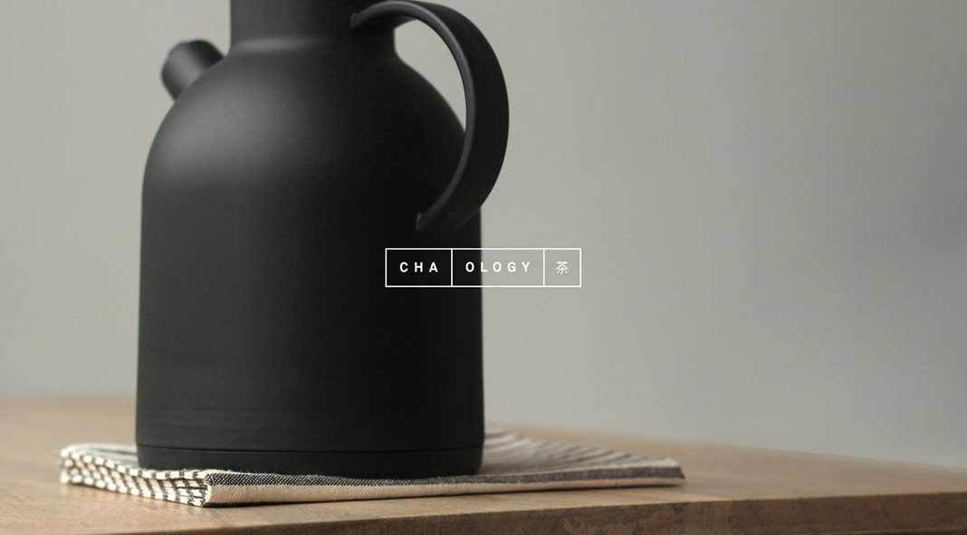
Graphic design, brand development, and spatial design by creative studio Alphabet for Cha.ology, a unique Japanese tea-house in the heart of Manchester City Center.
In 2016, the skilled team of Manchester, UK based studio Alphabet was commissioned to develop the brand identity and spatial design for Cha.ology, a new Japanese tea-house in the heart of Manchester City Center. The The tea-house captures Japan’s tradition in a clean and contemporary way. Alphabet’s creative team worked closely with Mei Lee, the founder of Cha.ology, in order to develop a contemporary brand that is deeply rooted in Japan’s heritage.
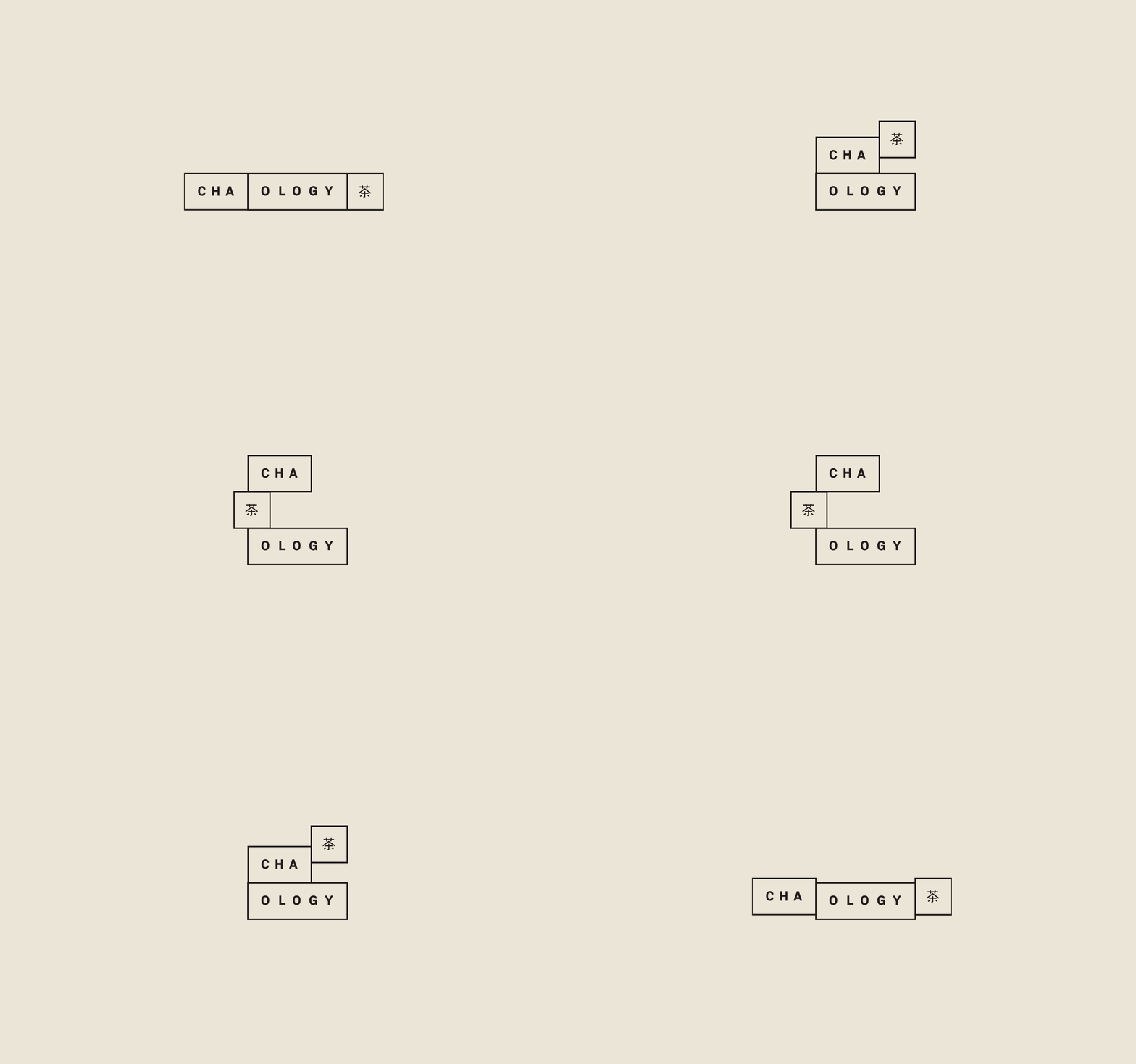
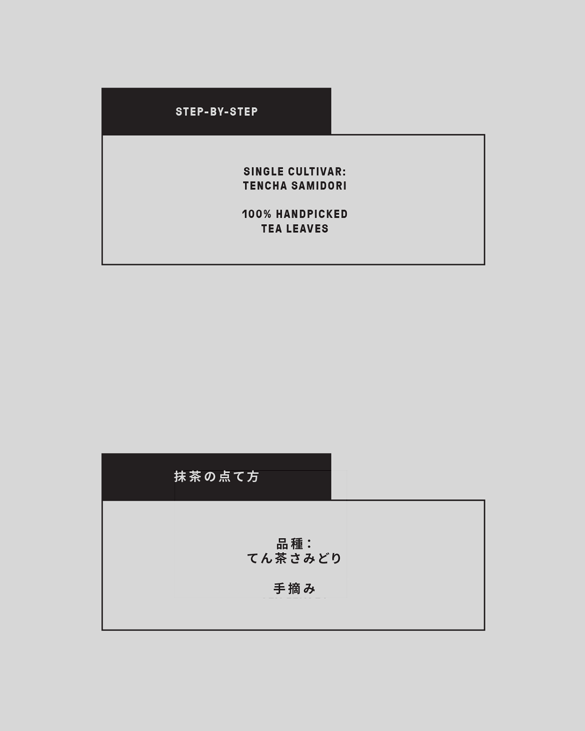
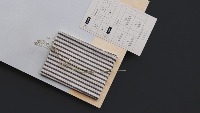
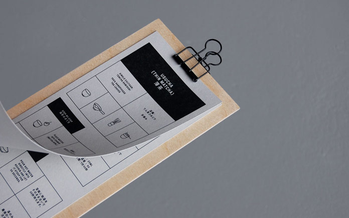
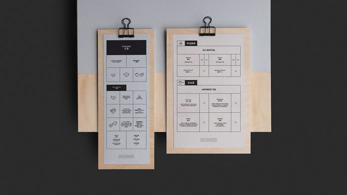
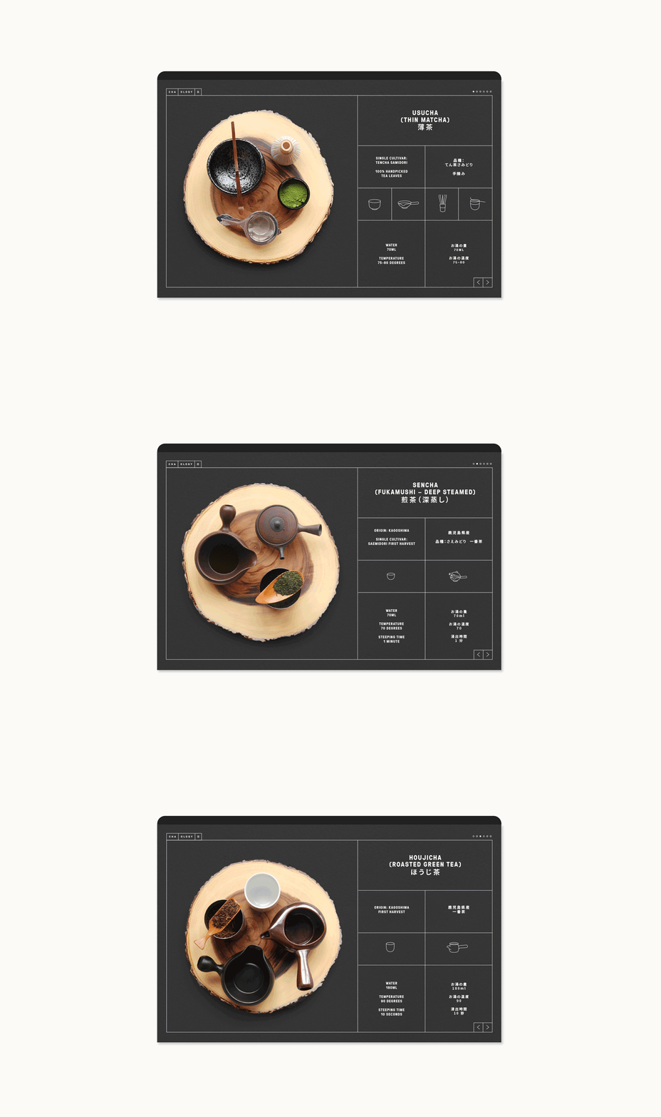
Heavily influenced by the traditional Japanese tea-drinking culture, Alphabet’s design team took some inspiration from the Tatami flooring system, which is a type of mat used as a flooring material in traditional Japanese-style rooms. They consist of several blocks that stack and slot together in a grid-like formation. This grid system has been used as a basis for the entire brand experience. Just have a look at the images below. For more, please visit Alphabet’s website.


All images © by studio Alphabet. Feel free to find more graphic design and branding inspiration on WE AND THE COLOR.

